
Warm As A Design Trait: Makes People Stay, Come Back and Recommend You to Their Friends
Let's be precise about something from the start: a warm design aesthetic is not a beige living room. It is not a cosy sans-serif and a terracotta swatch and calling it a day. Warmth in design is an emotional position, a full system of decisions that tells your audience they are welcome here, that something considered and human-made this; and that they can stay as long as they like. In my experience, it is one of the most commercially effective traits in the whole system; and one of the most consistently misunderstood.
Here's what warmth actually is, how it works and how to deploy it without it dissolving into something toothless.
What the Warm Trait Is Actually Saying
Warmth in design is a signal. Before a viewer reads a single word, before they've processed your copy or clicked anything, they've already received the message warmth sends: safe, human, worth your time. That message is assembled from dozens of micro-decisions: the temperature of your palette, the weight of your type, the softness or sharpness of your forms, whether your imagery looks like a real place or a set. When all of those decisions point in the same direction, the effect is not subtle. It is felt.
The keywords that cluster around warmth are amber, ochre, terracotta, hand-touched, inviting, nourishing, familiar; and the moods they produce are comfort, trust, intimacy and what I'd call permission to exhale. There's something about a genuinely warm design environment that physically relaxes the viewer. I think this is why warm brands tend to have unusually loyal audiences: the design itself is doing retention work before the product has even spoken.
Warmth is not softness, though. This is the distinction most people miss. A warm design aesthetic can be bold, confident and structurally rigorous. It can be typographically serious. It can carry real authority. What it cannot be is indifferent to the person looking at it. The opposite of warm is not strong; the opposite of warm is Cold: precise, cerebral, deliberately withheld. Cold is a legitimate and powerful trait in its own right, but it is a different emotional contract entirely. Warm says: come in. Cold says: earn it.
The Warm Colour Palette: What It Actually Involves
A warm colour palette design is not just the warm half of the colour wheel applied liberally. That thinking produces muddy, generic work. Warmth in colour is about temperature relationships: a background so close to natural that it reads as a material rather than a colour choice; an amber ochre design accent that carries the specific weight of something aged and honest; shadows that lean red-brown rather than grey; highlights that read like afternoon light rather than studio flash.
The palette that does this work best sits in a specific range: raw linen, beeswax yellow, the exact brown of aged paper, terracotta with enough warmth to glow, the deeper amber ochre design territory where colour starts to feel almost edible. The skill is in restraint: two or three of these together, held steady, rather than every warm tone at once (which tips into autumn-themed chaos rather quickly; I say this from having seen it many times).
Imagery follows the same logic. Warm photography has golden-hour light, physical surfaces you can almost touch, people who look unhurried. A texture set built from amber and ochre tones, carrying the slightly-worn quality of materials that have a history, sits precisely in this territory: textures that read as analogue even in a digital context.
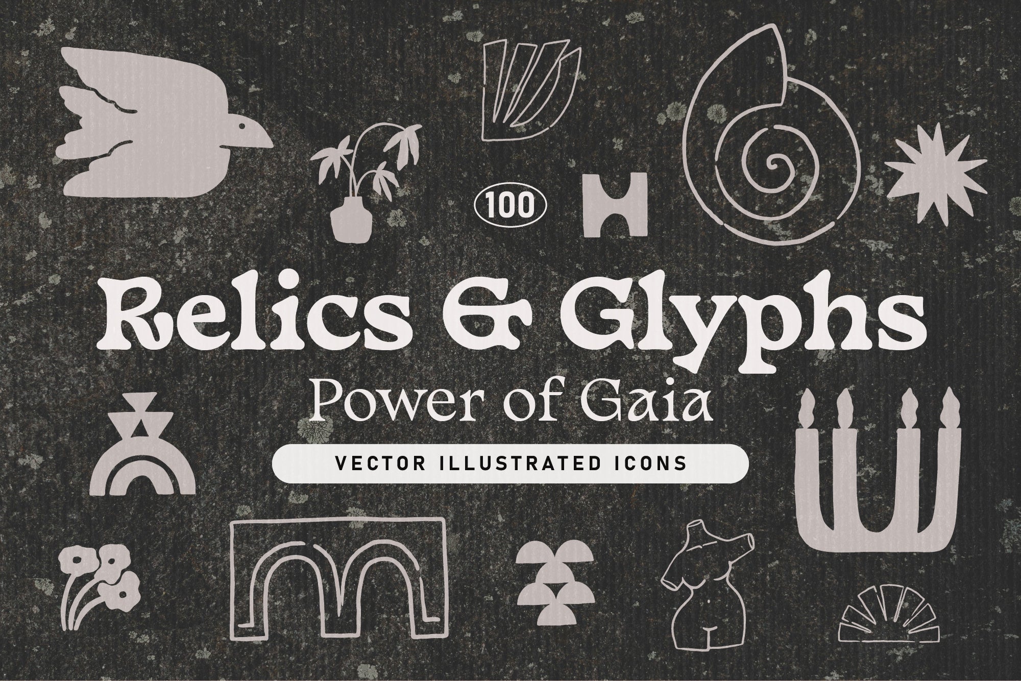
Shop: RELICS AND GLYPHS Vector Elements →
Warmth in Typography, Form and the Welcoming Brand Aesthetic
Typography carries warmth or withholds it with remarkable efficiency. A welcoming brand aesthetic tends to use type that has some history in it: serifs that were drawn with a broad-nib pen and still carry that origin in the letterforms, the slight optical correction that makes a typeface feel made by a human rather than plotted by an algorithm. Even in display weights, warm typography has a generosity to it; counters that breathe, spacing that invites reading rather than demanding it.
Forms contribute too. Warmth in design favours soft geometry: slightly rounded corners rather than sharp right angles, organic shapes that suggest natural objects, layout that allows rest. This doesn't mean amorphous or structureless; some of the most warmly designed objects have rigorous underlying grids. It means that the eye is never made to feel it has encountered a hostile surface.
A warm autumnal pattern set is a strong example of this in practice: a rich, cosy visual identity built from warm seasonal colour, organic botanical forms and an underlying structure that holds everything coherently without freezing it.

Shop: Gouache Organic Shapes + Patterns →
Where Warm Earns Its Commercial Case
Here is where I want to be direct with you: warmth is not a nice-to-have. It is a retention strategy. Study after study in consumer psychology shows that perceived warmth drives trust; trust drives every downstream metric that matters; repeat purchase, word of mouth, the willingness to forgive the occasional operational error because the brand has enough goodwill in the tank. A warm design aesthetic, properly executed, is compounding interest. You invest in it at the beginning and it pays returns for years.
Warm works particularly well wherever the product is tied to physical comfort, personal ritual or domestic life: food, home, craft, fashion, wellness, independent publishing, hospitality. In those categories, warmth is practically table stakes; if your design is cold while your product is candlelit and handmade, there is a disconnect that customers feel without being able to name it; they will not come back for a second look.
Warm pairs with extraordinary generosity. Tactile, Heritage, Organic and Personal all sit alongside warmth with almost no friction; the combination of Warm and Tactile in particular produces some of the most immediately convincing brand aesthetics I've seen. Browse the AIF Library for the full trait system, where you'll find Cold as the natural counterpart: the same set of tools, calibrated for a completely different emotional register.