
Organic As A Design Trait: Going Wobbly Is Completely Fine
Have you noticed that everything has gone a little wobbly? Not broken, not sloppy: wobbly in the particular way of a shape that was drawn by a hand rather than plotted by a tool. The organic design aesthetic is the design world's collective exhale after years of spending too long at right angles; it is the return of the blob; the imperfect curve, the brushstroke edge that doesn't quite close.
What the Organic Trait Is Actually Saying
The organic trait describes design that borrows its logic from nature rather than from architecture. Its forms are biomorphic: they curve, bulge, taper and wobble the way living things do, without the clean predictability of a tool-set point. Its edges are hand-drawn or hand-painted; its compositions suggest growth rather than construction.
The keywords here are fluid, biomorphic, imperfect, natural, freeform; and the emotional register they produce is warmth, ease, approachability and a specific kind of joy that rigid geometry simply cannot access. There is something fundamentally reassuring about an organic form. Your nervous system recognises it as alive and it responds accordingly.
The opposite of Organic is Industrial: structural, constructed, built from exposed logic and raw material rather than living form. Neither is superior; they are different visual languages for different intentions. Understanding that contrast is essential, because Organic only becomes meaningful when you know what it is not.
I find the organic trait genuinely interesting precisely because of that tension with Industrial. Most functional design leans structural by default, because constructed systems are easier to maintain and scale. Choosing to go Organic is a deliberate decision to prioritise feeling over efficiency; which, in 2025 and 2026, is a quiet act of aesthetic courage.
How the Organic Aesthetic Actually Shows Up
In practice, the organic design aesthetic appears in shapes that refuse to be perfect. Think of the gouache-painted blob that serves as a background element: not a circle, not an ellipse, but something that sits between the two in a way that only a brush loaded with pigment and pushed with intention can produce. Think of hand-drawn borders that drift; illustrated icons where every leaf has its own slightly different silhouette; pattern repeats where the repetition feels warm and human rather than mechanical.
Colour in organic design tends toward the botanical, the earthy and the natural: sage, terracotta, warm cream, the specific slightly muddy green of foliage in low light, clay pink. These are colours that exist in the landscape; they feel right in organic compositions because they carry the same logic.
A hand-painted gouache shape collection is a clean example of what the organic aesthetic looks like in a production-ready asset set: pigment-forward and shaped by the physical movement of a brush rather than the precision of a vector tool. Place shapes like these in a layout and the design exhales. That quality is not accidental; it is the entire point.
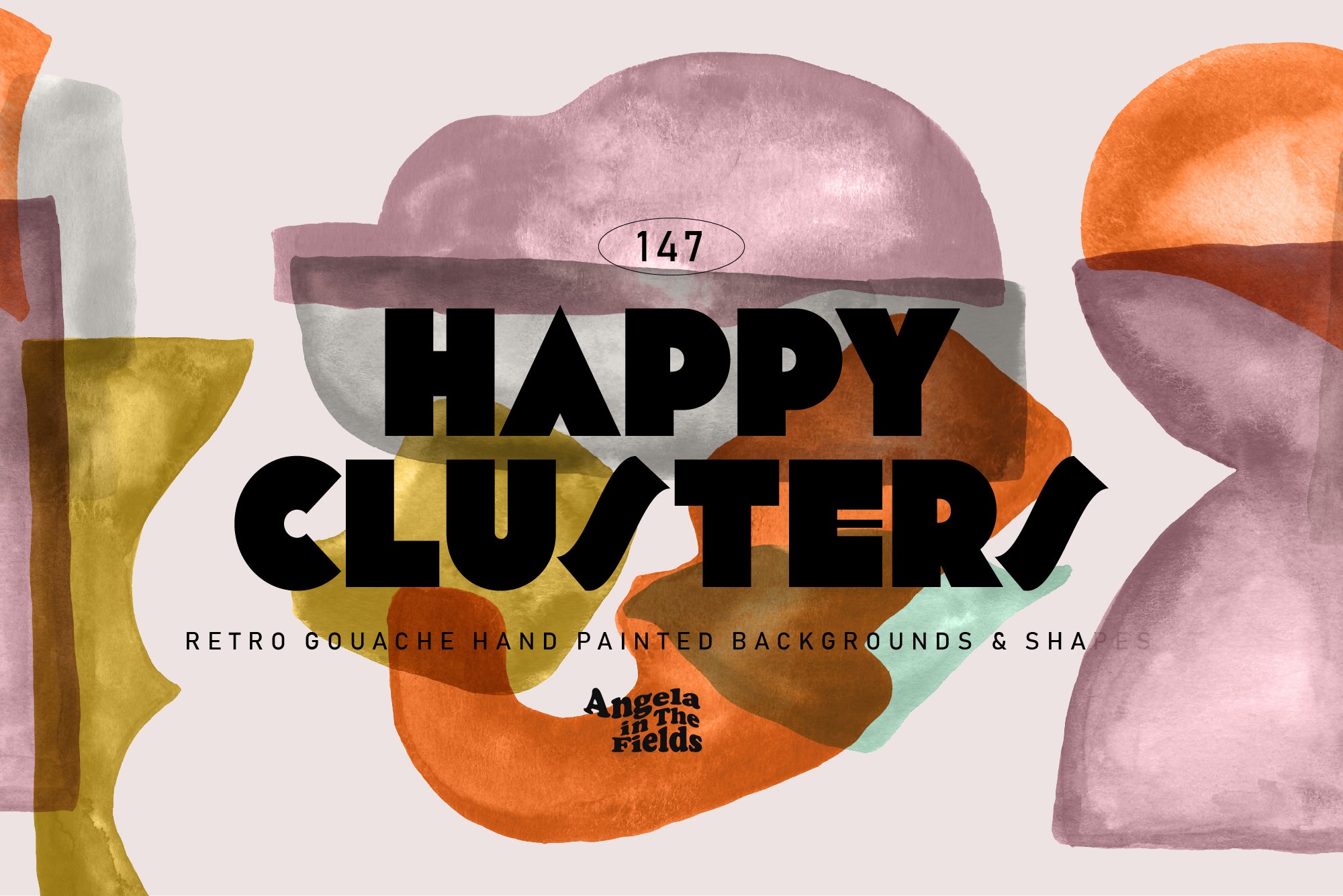
Shop: HAPPY CLUSTERS Gouache Shapes →
Typography in organic design tends to soften too: rounded sans-serifs, hand-lettered scripts, display type with subtle irregularity. You are looking for letterforms that feel like they grew, not ones that feel like they were manufactured.
Why the Organic Aesthetic Is Everywhere Right Now
Here is my honest take: the organic aesthetic is surging because the alternative became exhausting. Years of hyper-refined, AI-assisted, grid-locked visual perfection have created a real hunger for something that looks like a person made it. The hand-drawn aesthetic is not nostalgic; it is a calibration correction. It is design saying: we went too far in one direction and now we are finding our way back.
The biomorphic design wave that has rolled through branding, packaging, editorial and social media over the past two years is not a trend in the fashion sense; it is a response to a cultural moment. Brands that have adopted organic form are not just following a visual fashion: they are signalling an understanding of what their audience actually craves, which is proof of human involvement and the warmth that comes with it.
Natural shapes in branding are particularly effective right now because they stand out. In a category where everyone is going geometric and modular, a brand that uses an organic visual language occupies genuinely distinct territory. The imperfect design choice is, counterintuitively, a strategic one.
For wellness, wellbeing and nature-coded product categories, organic form is almost mandatory. A collection built specifically for this territory does a very particular job: botanical in its palette and form language and designed for brands that want to look like they belong in the natural world rather than a corporate spreadsheet.

Shop: Spring Wellness Patterns + Elements →
What Organic Pairs With and Where to Tread Carefully
Organic pairs naturally and immediately with Warm: the combination of soft form and warm colour produces an almost instant sense of comfort and welcome. It works beautifully with Tactile, because hand-drawn edges and physical surface texture share the same fundamental quality: evidence of a human hand. It sits well with Personal, with Heritage and with anything in the light, nature-led end of the AIF Library aesthetic spectrum.
The pairing to handle with care is Organic with Industrial: this is the territory of deliberate visual tension and it can be extraordinary when it works. A single organic form against a rigidly structured, raw-material background creates exactly the kind of focal point that makes a viewer stop. But it needs intention; organic and industrial elements dropped into the same space without a clear reason look undecided rather than sophisticated.
Cold is similarly tricky. Organic-Cold is not impossible, but it is a narrow corridor: the forms need to be genuinely pure, the palette genuinely restrained. Get it right and it reads as sculptural; get it wrong and it reads as formless.
The most important thing to understand about the organic trait is this: imperfection is not failure. Every wobble in the edge of a hand-painted shape is evidence of exactly the thing your audience is looking for. The asymmetry is the quality. Trust it, my friend; your nervous system already does.