
Tactile As A Design Trait: On Why Brand Needs to Start Being More Errrr, Touchy
Let's talk about the specific, almost irrational pleasure of a surface that has actual texture; not simulated texture, not a filter that adds grain in post, but the real thing; the kind you can feel from across the room without touching it. The tactile design trait is about exactly this quality; the design that makes you want to reach out and run a finger across it, even when it's sitting flat on a screen in front of you.
In a world where practically everything has migrated to a backlit rectangle, tactile design has become one of the most quietly powerful signals a brand can send. I'd argue it's one of the most underused, too. Here's what it actually means, why it works and what you should be doing with it.
What the Tactile Trait Actually Signals
Tactile design isn't just about looking handmade; it's a full visual language. The moment a piece of design communicates physical presence; grain, weight, surface irregularity, the kind of evidence that a human hand was involved at some point; it starts doing emotional work that smooth, flat, digitally-perfected design genuinely cannot do. It signals craft, the sense that something took time and care and probably a bit of elbow grease; it signals that the person behind it thought carefully about material, not just about aesthetics, which is a more unusual thing than it sounds.
The keywords that sit in this territory are textured, handmade, analogue, surface-rich, tangible; and the moods they generate are warmth, intimacy, craft pride, sensory pleasure and; this is the one I find most interesting; slowness. Tactile design is a speed signal as much as anything else. It quietly says: this was not generated in thirty seconds and it was not designed to be consumed in thirty seconds either. In 2026, that reads as a genuinely radical position.
The opposite of Tactile is Digital; and that contrast is worth sitting with, because it's not a hierarchy. Digital isn't worse, it's just a different register entirely; clean, flat, precise, infinitely reproducible. Tactile is none of those things and that's precisely the whole point of it.
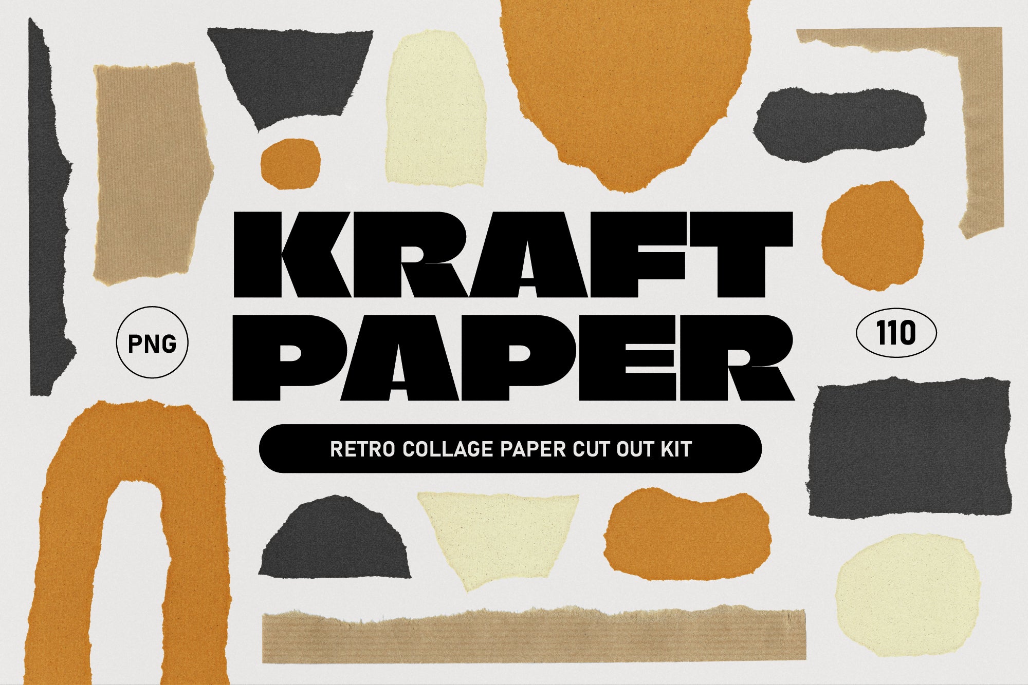
Shop: Abstract Kraft Paper Shapes Set →
How It Actually Shows Up
The classic expressions of Tactile are the analogue processes that leave evidence of themselves in the finished object: letterpress, where the ink sinks into the paper with visible pressure and you can feel the impression from the back of the sheet; screen printing, where the ink deposit is just slightly uneven in a way no digital printer replicates; hand weaving, where every thread carries the tiny rhythmic wobble of a real person's hands; hand-thrown ceramics, where no two pieces share the same diameter.
In graphic design, I'd say tactile quality comes through most reliably in a few specific choices. Paper grain showing through ink is the big one; it's the difference between a label that looks premium and one that actually feels premium even as a JPEG. Textures that don't repeat perfectly, because they were pulled from actual physical surfaces rather than tiled digitally. A deliberately uneven baseline on hand-lettered type; the bloom of ink spreading into uncoated stock.
In colour, I always advise going for the muted, the natural and the slightly off: raw linen, warm sand, the specific brown-grey of unbleached paper, deep botanical greens, earthy terracottas. Think of the palette as: what does this material look like in its most honest, unprocessed state? That's your answer.
Typography follows the same logic; serif typefaces with genuine history and visible quirk; the kind that were originally drawn with a pen nib and still carry that memory in the letterforms. Hand-lettered scripts where you can almost feel the pressure variation. Type that sits on the page with just enough imperfection to feel like it was placed there, not generated.
What Tactile Pairs Well With
Tactile is one of the most versatile traits in the whole system, which makes sense when you think about it; human touch is one of the most universally legible signals in design, full stop. It pairs naturally and obviously with:
Warm: tactile surfaces and warm colour together read immediately as comfort and safety; this is the entire visual territory of sourdough bakeries, artisan ceramics studios, independent bookshops and every brand that wants its customer to feel like they've been handed a mug of tea.
Heritage: tactile craft and historical reference reinforce each other with almost embarrassing efficiency. The suggestion that something has been made the same way for a very long time is amplified enormously by surfaces that look and feel as though they actually have been.
Organic: natural materials and natural forms are natural companions (yes, I went there). Beeswax finishes, botanical papers, undyed textiles, wood grain; this combination reads as sustainable, considered and genuinely earthy rather than just performing earthiness, which is a distinction worth making.
Personal: when Tactile combines with a genuine individual voice, you get something that feels almost like a handwritten letter. A brand that looks handmade and sounds like an actual person talking directly to you is, frankly, one of the hardest things for a larger competitor to replicate; I'd go for this combination every time for independent or personal brands.
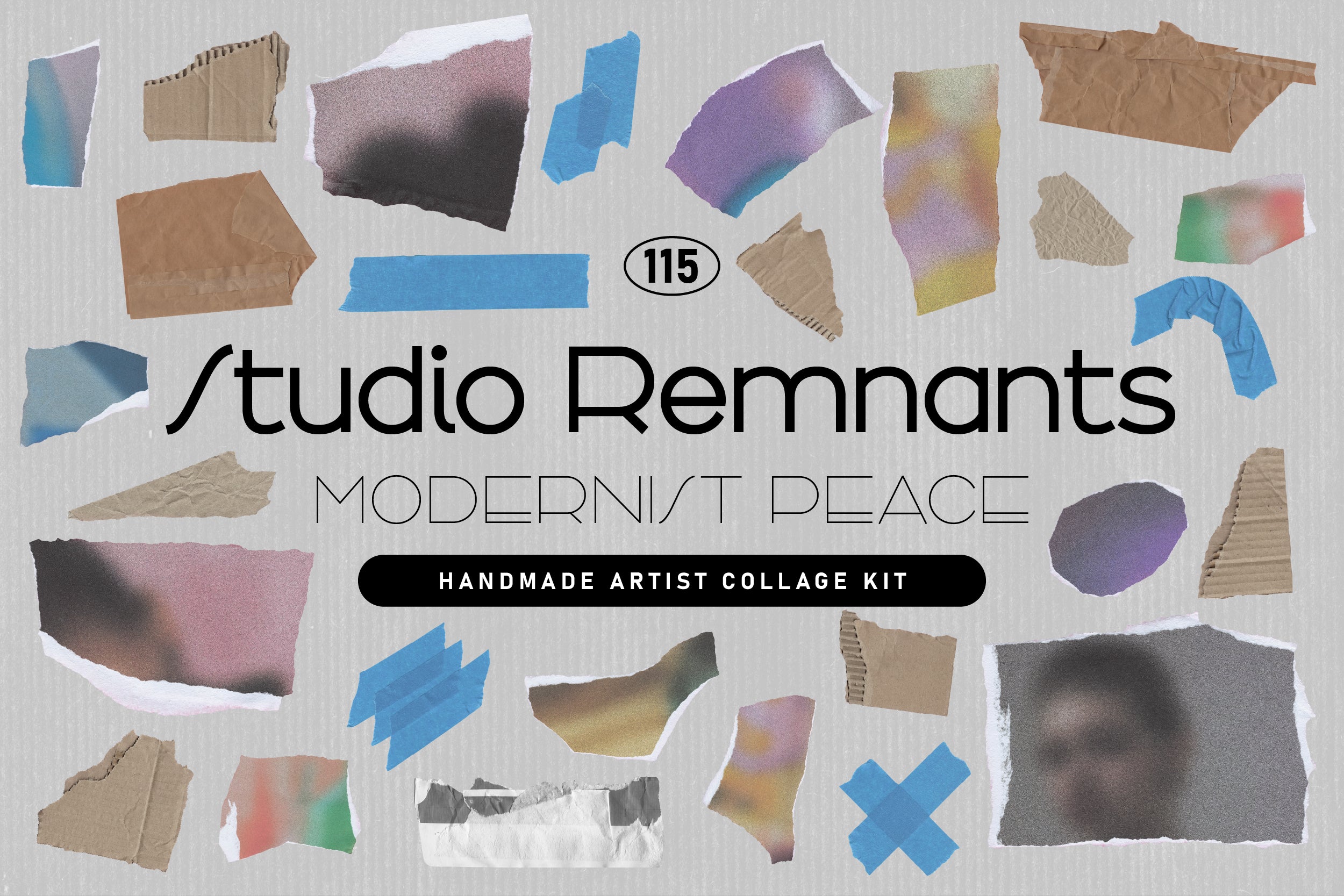
Shop: STUDIO REMNANTS Collage Kit →
If you're working with Tactile, be thoughtful about pairing it with Cold or Systemic; not because it's impossible, but because the contrast needs very deliberate handling. Tactile-Cold is genuinely interesting (expensive minimalist stationery, high-end architectural materials) but it's a sophisticated tonal balance that tips into incoherence faster than you'd think.
Where to Actually Use It
Packaging is where Tactile earns its keep most immediately and most obviously; the physical object has to be held and the paper choice, the print finish, the weight of the box all communicate before the customer has opened a single thing. If your packaging is tactile, the unboxing experience starts the moment someone picks it up; which is, if you think about it, the most valuable real estate in the whole customer journey.
Fashion with genuine material credentials; natural fibre brands, heritage workwear, sustainable clothing labels; uses Tactile constantly and for good reason. When your product story is fundamentally about material quality, your design language should say exactly the same thing the fabric does; otherwise there's a disconnect that customers feel even when they can't name it.
Social media is, perhaps counterintuitively, an excellent context for Tactile. In a feed full of flat product photography and AI-generated imagery where everything is impossibly smooth, a surface with genuine grain and physical presence stops the scroll in a way that polish absolutely does not. If your competitors are all going hyper-clean, going tactile is not just an aesthetic choice; it's a strategic one.
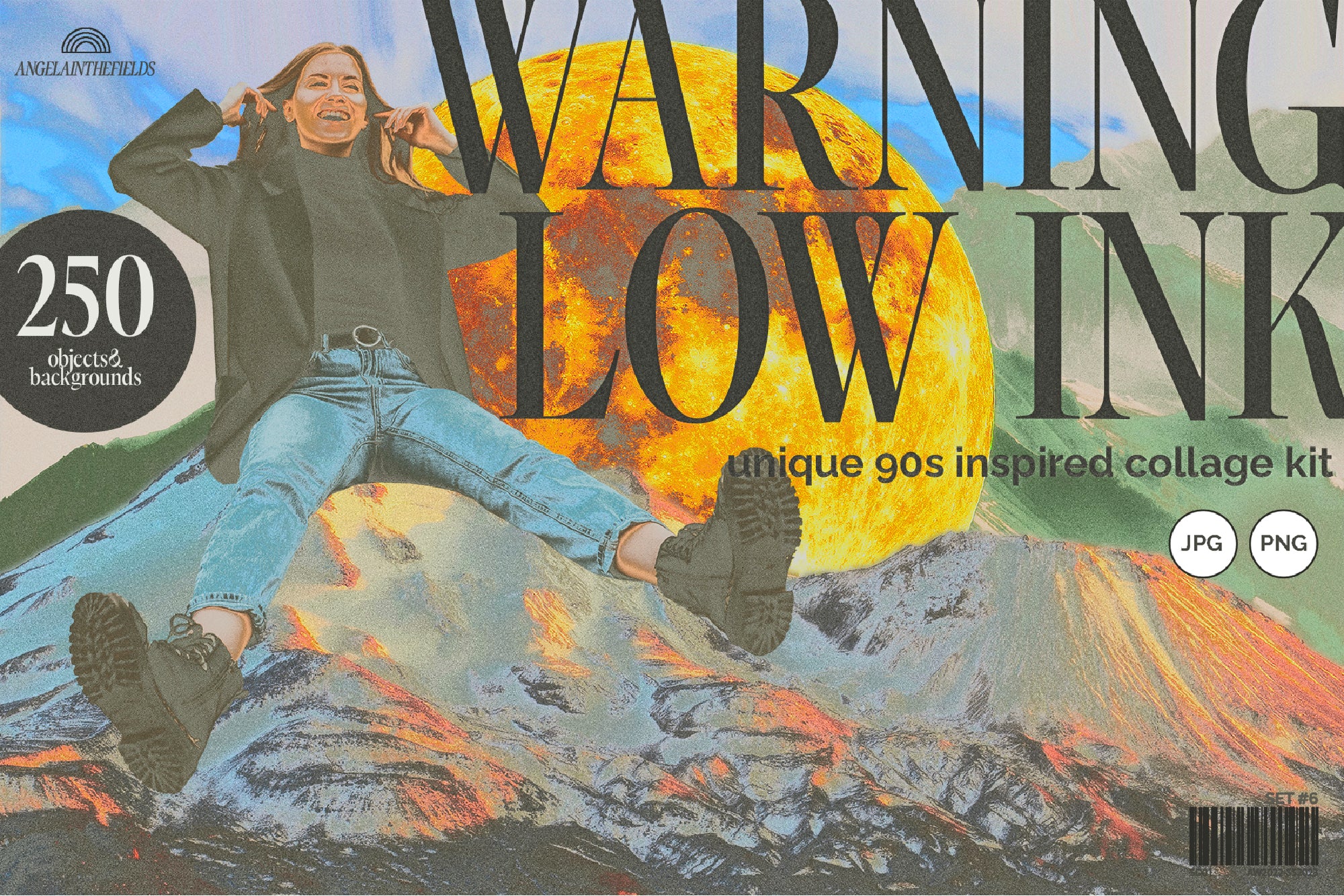
Shop: 90s Collage Low Ink Kit →
Explore more of the AIF trait system in the AIF Library and see how Tactile's opposite, Digital, operates when design lives entirely on the other side of that equation.