
Playful As A Design Trait: Please Stop Taking It So Seriously
Joy is not a personality quirk you either have or don't. A playful design aesthetic is a deliberate creative strategy: one that the most culturally resonant brands in the world have been using to build loyalty, spark conversation and make people genuinely glad to encounter them.
Why a Playful Design Aesthetic Is Actually a Business Decision
Here's what the serious-minded creative director in the corner office keeps getting wrong: playful does not mean unserious. It means choosing delight over default. It means understanding that people are exhausted by content that treats them like problems to solve rather than human beings who want to feel something good, if only for a moment.
I always advise clients who are nervous about going bright and joyful to look at the brands eating their lunch. Liquid Death sells canned water through death-metal iconography and genuinely absurd humour. Oatly made oat milk a cultural statement. Neither of these is a category where you'd expect wit to be a winning move; both of them proved that wit is almost always a winning move, because almost no one is brave enough to use it properly.
A playful brand design operates at the intersection of confidence and invitation. It says: we know exactly who we are and we'd like you to have fun with us. That kind of clarity is rare. Rarity, in visual culture, is the whole game.
Want a starting point for your own visual language? The AIF Library has exactly the kind of tools that make "joyful" feel effortless rather than forced: loose, irregular gouache forms in colours that feel genuinely alive, not candy-coated.
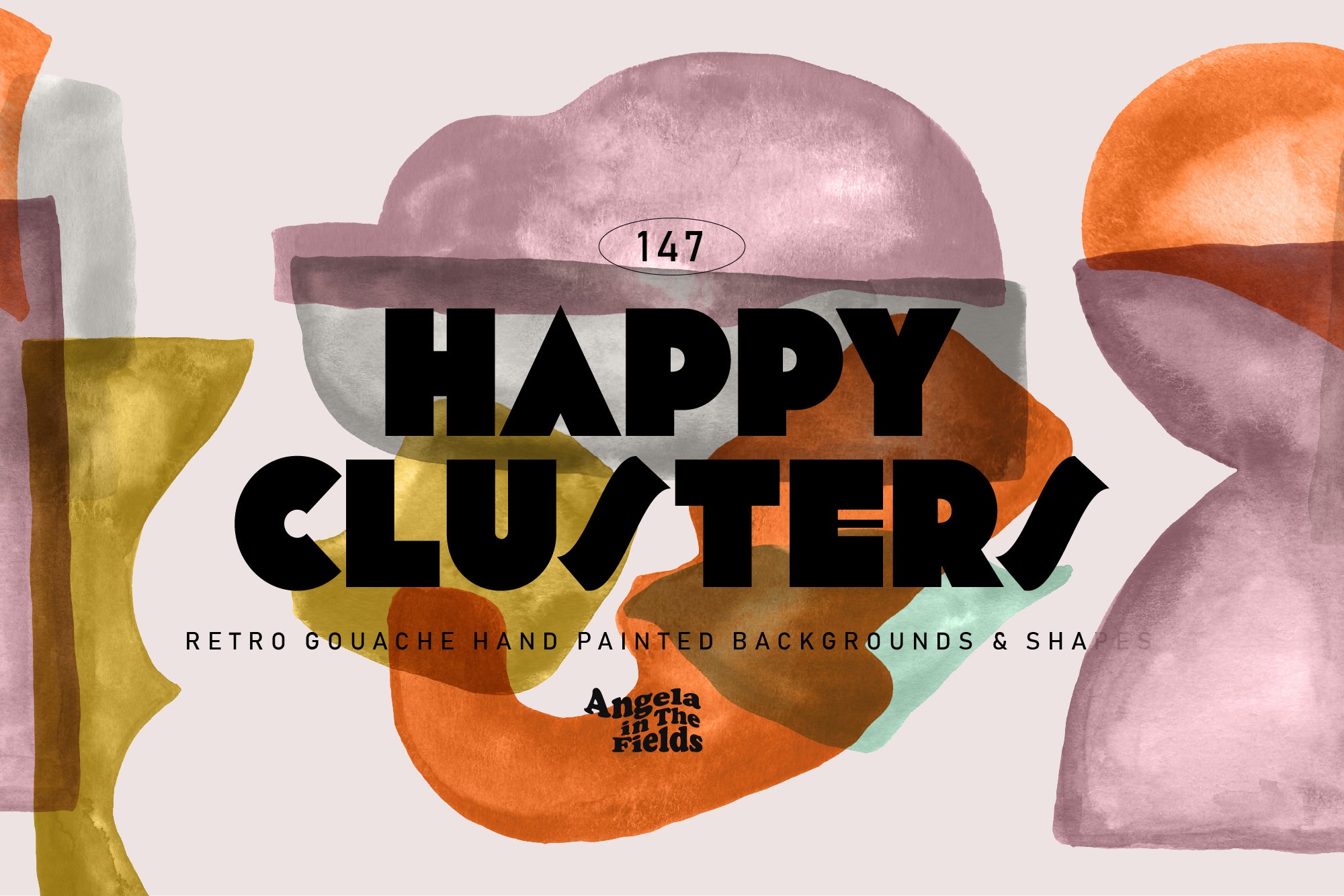
Shop: HAPPY CLUSTERS Gouache Shapes →
What a Fun Visual Identity Actually Looks Like (and What It Doesn't)
The most common mistake is confusing playful with childish. Childish is unresolved: bright colours without structure, shapes without rhythm, fonts that communicate "we bought a Canva template" rather than "we made something." Playful is a point of view applied with precision.
Joyful aesthetics work because they carry internal logic. Think about the visual systems behind brands like Glossier, Mailchimp or Oatly (again): every element is considered. The colour palette has range but not chaos. The typography is legible even when it's expressive. The illustrations feel human because they are human: imperfect, a little wobbly, made with something resembling a hand rather than a renderer.
Brand joy is not decoration. It is the argument your brand makes about what it values. A brand that leans into fun visual identity is telling the world that it trusts its audience to be intelligent, emotionally open and resistant to boredom. That's a bet worth making.
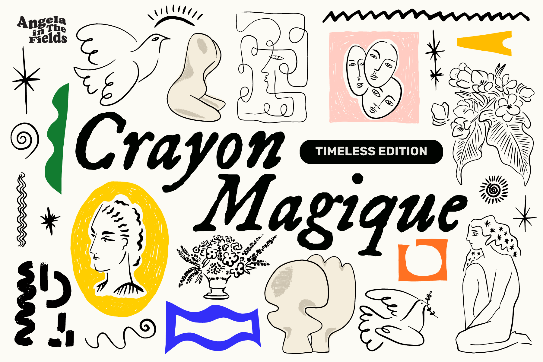
Shop: 200+ Retro Modern Doodle Art →
Playful Brand Design and the Traits It Lives Next To
No trait exists in isolation; that's one of the things the AIF Library gets right in how it maps visual personality. Playful sits in productive tension with a few neighbours.
On one end: Serious. The opposite trait. Serious brands command respect through restraint: every choice is considered, nothing is wasted, the overall effect is one of earned authority. You need that pole to exist to understand what Playful is doing. The smartest playful brands borrow a little of that structural rigour and then put a wobble on it.
On the other end: Maximalist. If you've looked at the Maximalist trait in the AIF Library, you'll know the overlap: both Playful and Maximalist aesthetics embrace abundance, refuse the tyranny of white space and invite the eye to wander. The difference is intention. Maximalism is a total worldview: more is a philosophy. Playfulness is a register: it's how you speak, not just how much you put on the page.
The brands that get this right tend to sit somewhere in the middle: structured enough to be legible, loose enough to be loveable. They deploy joyful aesthetics the way a great comedian deploys timing: with apparent ease that conceals enormous craft.
Serious Is Safe; Playful Is the Braver Call
My instinct here is that most brands retreat to serious by default not because serious is right for them, but because playful feels exposed. It requires committing to a point of view. It requires accepting that some people will not get the joke, and being fine with that, because the people who do get it will love you for it.
The brands that have leaned into a playful design aesthetic and won are not the ones that happened to have a "fun" product. They are the ones that decided, at a strategic level, that joy was worth protecting: that delight had a place in how they showed up, every single time, across every touchpoint. That decision is repeatable. It is teachable. It is, above all, available to you right now, my friend, regardless of what category you're in or how beige your competitors have decided to be.
Joy is not something that happens to brands. It's something brands choose. And the ones that choose it tend to be the ones worth remembering.