
Serious As A Design Trait: Gravitas, Credibility and the Art of Visual Weight
What does it mean to walk into a room and be taken seriously before you open your mouth? It happens: a certain stillness in the posture, a quietness that doesn't perform itself. The serious design aesthetic works exactly the same way; it communicates weight, authority and credibility before the viewer has processed a single word of copy. The brands that get this right don't shout. They don't need to.
This is the trait I return to again and again when a client needs to occupy the top of their category without buying their way there with noise.
What the Serious Trait Actually Signals
Gravitas in branding is not the same thing as being boring. I want to be very clear about that distinction because it trips people up constantly. Serious design is not design that refuses to be interesting; it's design that earns interest rather than begging for it. There's a fundamental difference between a brand that says "look at me" and one that makes you lean forward because something in its visual presence suggests it has something worth your time.
The keywords that cluster around the Serious trait are: authoritative, weighty, composed, credible, considered, precise. The moods generated are trust, respect, certainty, professional gravitas; and, if handled with real skill, a kind of quiet magnetism that lighter brands genuinely cannot buy. Credible brand design speaks first through what it withholds: excess colour, decorative noise, anything that signals "we're trying very hard to entertain you."
The opposite of Serious is Playful; and that contrast is genuinely illuminating. Playful design charms, disarms, invites. Serious design commands. Neither is superior; they serve entirely different relational dynamics between brand and audience. The choice between them is a choice about what kind of authority you want your brand to project, which means it's ultimately a strategic decision before it's an aesthetic one.
Weight in design comes from restraint. From the willingness to let a single typographic element carry an entire layout. From colour that doesn't apologise for being dark. From white space that doesn't feel empty; it feels deliberate.
How It Shows Up in Practice
An authoritative visual identity tends to share a set of consistent characteristics; once you know them you'll see them everywhere in the upper reaches of any professional category.
Typography carries most of the weight. The typefaces that communicate seriousness are ones with long histories and disciplined construction: classical serifs, geometric sans-serifs with high x-heights and tight optical spacing, condensed grotesks that stand like columns on the page. Type that never fidgets. Size used with courage; large, unhurried, completely comfortable occupying space without justification.
Colour does its work through restraint. The palette of a serious brand is typically narrow: near-blacks, deep navies, forest greens, the kind of warm dark that reads as authority rather than aggression. Occasional bone or warm white as contrast. Accent colour, if it appears at all, is used with the precision of punctuation; one small beat that lands because everything around it is quiet.
Heavy geometry, deep shadow work, materials that read as weight: these are the visual tools of the serious design aesthetic at its most structurally confident. There is no playfulness in a dark extruded form with precise chamfered edges. There is only authority.
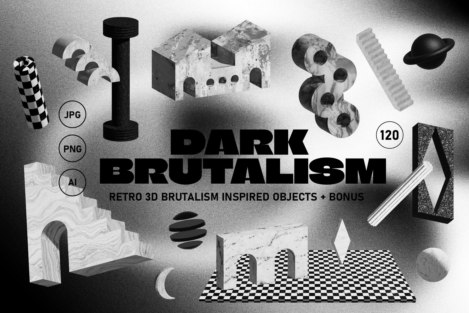
Shop: DARK BRUTALISM 3D Elements →
Layout follows the same logic as the typography and colour: composure above all. Asymmetry, when it appears, feels chosen rather than accidental. Grids are visible in the bones of the page even when no actual grid lines are present. Nothing drifts. Nothing spills.
Where Serious Design Does Its Best Work
Serious design earns its keep in the contexts where trust is the primary currency. This is not all contexts; I want to be direct about that. If you're marketing a children's birthday experience or a festival beverage brand, the serious design aesthetic is almost certainly working against you. But if your audience is making high-stakes decisions, even ones as ordinary as choosing a law firm, a financial adviser, an architect or a senior creative agency, then a serious visual identity is doing fundamental business work, not just aesthetic work.
Professional services are the obvious territory: legal, financial, medical, consultancy. The category signals that competence is assumed and that trust is the variable; serious design reinforces both sides of that equation simultaneously. You look like you know what you're doing. You look like someone who doesn't need to convince anyone of that.
But serious design has a more interesting argument to make in contexts where it's less expected. A food brand that is quiet and composed in a category full of exclamation marks is making a loud strategic statement through the very absence of loudness. A fashion brand that refuses to shout communicates a kind of insider confidence that chases customers rather than catching them.
For professional environments specifically, real architectural spaces with actual depth and shadow create the kind of context that makes a serious brand identity feel at home rather than stranded in a white studio void. Environment is not neutral. Where you place a brand matters to how it reads.
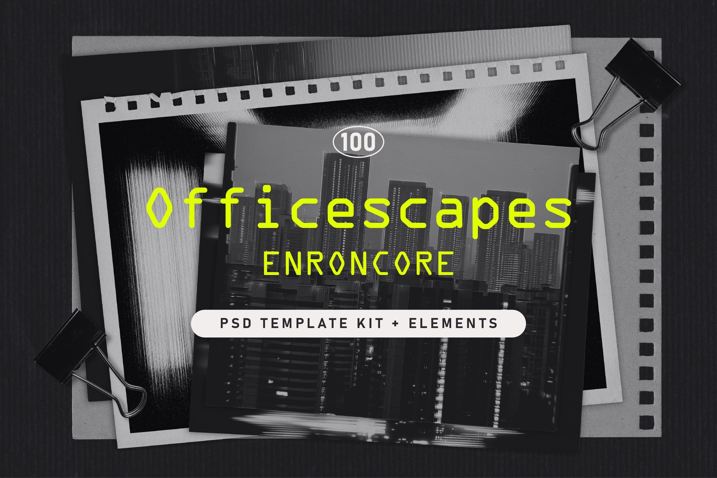
Shop: OFFICESCAPES PSD Mockups →
The Risk and the Reward
Here is where I'll offer my honest position: the serious design aesthetic is the most imitated and least understood of all the brand traits. Every agency has at some point handed a client a very dark, very minimal logo and called it gravitas. That's not what this is.
True seriousness in design takes confidence: not the confidence of having excellent taste (though that helps) but the confidence of knowing that your audience doesn't need entertaining; they need to feel certain. Get the temperature wrong and it becomes alienating; let it go stiff and it becomes bureaucratic; strip it without underlying quality in the decisions and it reads as cheap rather than restrained.
The reward, when you get it right, is occupying a position that is extraordinarily difficult to dislodge. Brands that communicate weight tend to accumulate it. Credibility compounds. Seriousness, once genuinely earned, becomes self-reinforcing in a way that lighter brand positions are not; it's very hard to become less authoritative once you've established a track record of visual seriousness done well. The work you put into achieving that position comes back to you for years.
Explore the full AIF Library for the complete traits framework.