
Maximalist As A Design Trait: More Is More, And If You're Not Ready For That, Here Is a Chair
Every design community has its puritans and the minimalists have been running the asylum for a good twenty years now. One grid, two typefaces, a palette of three colours named after weather conditions, and the assumption that restraint equals intelligence. I have a great deal of respect for minimalism. I also think it has been treated as the default sophisticated option for long enough that using it now, uncritically, is actually the less interesting creative choice. The maximalist aesthetic is not the undisciplined opposite of minimalism. It is a different argument entirely and it is time to take it seriously.
What the Maximalist Trait Actually Signals
The maximalist design aesthetic is a full-throated argument for abundance. More pattern, more colour, more reference, more visual incident: a surface that rewards the second and third look rather than delivering its entire payload in one composed glance. The maximalist design trait signals generosity, confidence and a deliberate rejection of the anxiety that says more is always too much.
The keywords orbiting this trait are layered, rich, expressive, abundant, complex and unrestrained; but the mood it generates, when handled with actual skill, is not chaos. It is exuberance. There is a version of maximalist brand design that is genuinely overwhelming and a version that is simply full, the way a very good room is full of things that reward investigation without exhausting the person standing in it. The difference between those two versions is editorial judgment, which is not the absence of maximalism but its highest expression.
The opposite of Maximalist is Minimalist and understanding that polarity is useful. Minimalist design communicates through restraint: it trusts the viewer to fill the space. Maximalist design communicates through accumulation: it trusts the viewer to navigate the richness. Both require trust; they just place it differently.
How the Abundance Aesthetic Actually Shows Up
In practice, the maximalist aesthetic organises its abundance through pattern layering, chromatic complexity and typographic eclecticism. Patterns overlap. Colours push against each other in ways that create optical vibration. Typefaces from different historical periods coexist because the visual effect of that collision is the point, not an error. Scale shifts dramatically within a single composition: something enormous next to something tiny, with no apology offered and none needed.
The postmodern and retro lineages are particularly rich territories for the layered design style. The visual culture of the 1980s and 1990s understood abundance as celebration, a direct response to the formal austerity of the mid-century; and that sense of liberation through surface complexity reads as freshness again now, particularly against the long run of flat, minimal and grid-constrained design that defined the 2010s. Bold, layered graphic energy is not nostalgia; it's structural.
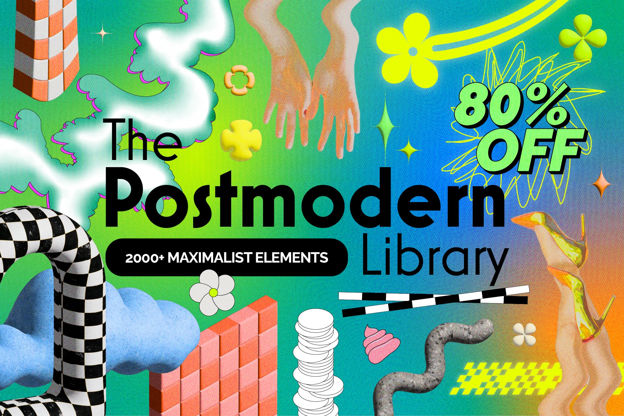
Shop: 80% OFF Retro Postmodern Library →
Y2K design is another seam worth mining here: the textures, overlays and graphic excess of early 2000s visual culture carry an inherent maximalist logic, one that contemporary designers are reworking with the benefit of hindsight, keeping the abundance and removing the naivety.
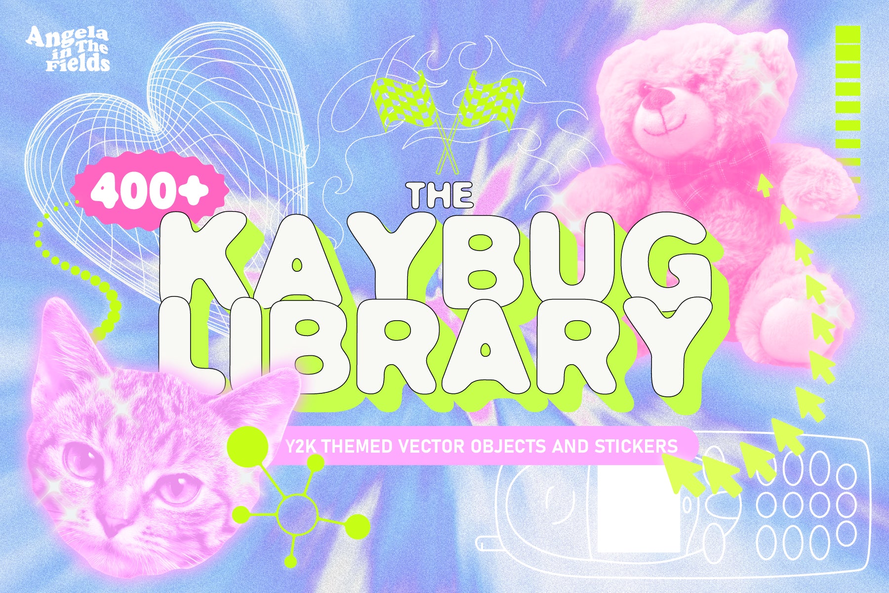
Shop: 400+ Y2K Elements + Bonus →
What the Layered Design Style Pairs Well With
Maximalism earns its keep in any context where sensory richness is a feature rather than a liability: fashion, beauty, food, entertainment, cultural institutions, independent retail. The brands using it most confidently right now are the ones that understand their audience is bored of clean, bored of restrained, and actively looking for something that feels like it was made by someone with genuine opinions about the world.
Pattern is the structural backbone of maximalist surface design: dense, repeating, layered, occasionally dissonant. A library of bold patterns is the core toolkit for this aesthetic and depth of catalog matters because the layered design style is built on combination and contrast.
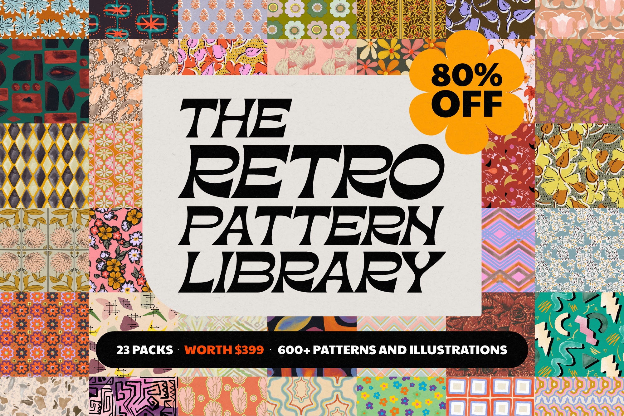
Shop: Retro Pattern Library 80% OFF →
The Case for Committing Fully
Here is the thing I always say when a client is considering the maximalist aesthetic and then hedging it: maximum commitment is the only version that works. A timid maximalism looks like an accident. A maximalism that has been partially edited back into restraint looks like someone started a party and then got nervous. The brands that do this well go in, fully, with the confidence of knowing that their audience came specifically for the abundance.
The maximalist design aesthetic is not for every brief, every category or every moment. But when it is right, it is entirely and completely right in a way that no amount of tasteful restraint can replicate. More is more and if you are not ready for that, I say this warmly: that is information worth having about yourself.
Explore the full AIF Library for the complete traits framework.