
Minimalist As A Design Trait: A Love Letter to Negative Space (and a Gentle Warning About Blandness)
The minimalist design aesthetic is, at its best, an act of supreme confidence: you are telling your audience that what you've left out matters as much as what you've put in. Rather than restraint born of laziness; it's restraint born of knowing exactly what you want to say and trusting your audience to receive it. The opposite impulse, the Maximalist approach, buries the viewer in abundance. But here? We're talking about the art of the carefully chosen, the deliberately placed, the intentional breath between words.
What Minimalism Actually Means (and What It Doesn't)
Minimalism is not white walls and emptiness. I want to clear that up immediately, because the most common crime committed in its name is confusing negative space with absence of meaning. Negative space design is active, not passive: it frames, directs, and gives weight to everything placed within it. When you leave room on a page, you are not saying nothing; you are declaring precisely and that is an entirely different thing.
What minimalism demands is hierarchy. One dominant idea, one clear visual entry point. A palette that earns every colour it uses. The clean brand aesthetic that resonates in the marketplace is never accidental: it's the result of relentless editing, of asking at every stage, "does this element pull its weight?"
The trap, though, is real. When restraint tips into timidity, you get work that says nothing because the designer was afraid to commit. Safe beiges, formless layouts, typography that whispers when it should speak: that is blandness dressed as minimalism and the two are not the same. The difference is intention. Confidence. A point of view.
The Tools of Restrained Visual Identity
If you want to work in a restrained visual identity, your texture and pattern choices become load-bearing. They carry the weight that colour and complexity might otherwise provide.
This is where texture earns its keep in the minimalist toolkit. Natural tones and subtle patterning give a surface genuine character without ever shouting. You get visual interest: the organic variation of a restrained material, the quiet sophistication of a palette that knows when to stop. But you don't get noise. I'd reach for textures in this family for any project where the brief is "clean but not cold," which is honestly the brief for most good minimalist work.
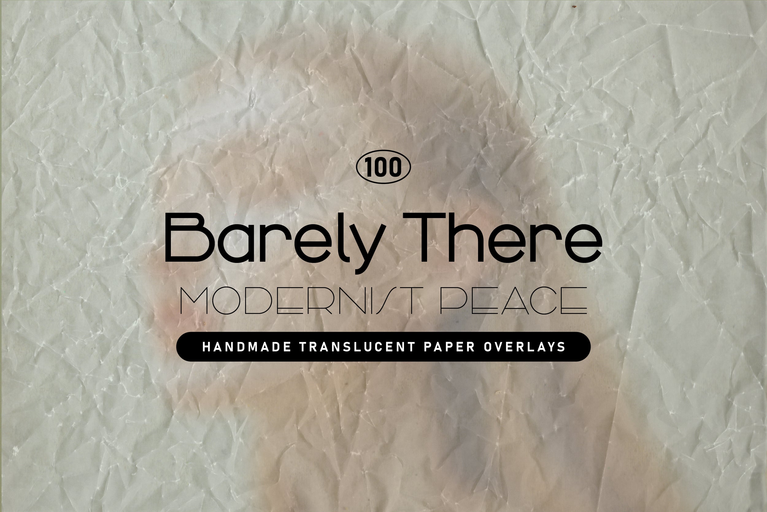
Shop: BARELY THERE Minimal Paper Overlays →
The principle at work here: texture is the minimalist's secret weapon. It lets you say "this is designed" without saying "look how much I've designed." That distinction matters enormously when you're working in this aesthetic.
Negative Space Design: Learning to Trust the Gap
The hardest skill in negative space design is learning to stop filling. Every designer has a moment of panic when looking at a composition that feels "too empty," and the instinct is always to add something. Resist that instinct. Sit with the discomfort. Nine times out of ten, the emptiness is doing exactly what it should.
Modern minimalism, the kind that actually communicates, uses space as punctuation. A pause. A breath. The visual equivalent of a well-placed full stop. The eye needs rest to process emphasis and if everything is equally prominent, nothing is.
For work that lives in this territory, earth-toned texture families are a quiet revelation. A set built in warm, retro-inflected earth tones sits in that understated register beautifully: subtle enough to support a minimal composition, warm enough to keep it from feeling clinical. I always advise designers working in the minimalist register to look for textures with this quality, the sense that something has been lived in rather than manufactured, because it brings humanity to a visual language that can otherwise feel remote.
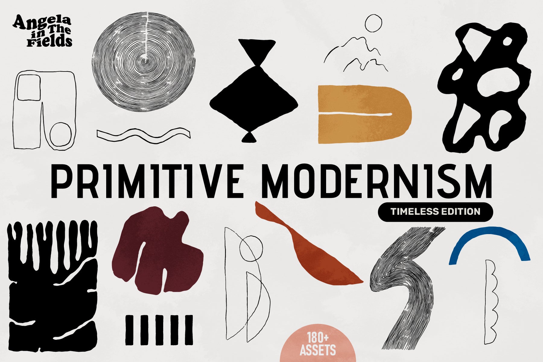
Shop: PRIMITIVE MODERNISM Vector Clipart →
The difference between modern minimalism and cold minimalism lives here: warmth. A surface that breathes, that has character, that feels chosen rather than defaulted to.
Where Minimalist Meets Its Interesting Opposite
Every aesthetic has a twin it argues with and the Minimalist's counterpart is the Maximalist: that glorious, unapologetic commitment to abundance, layering, and exuberant complexity. You can explore that opposite perspective in the Maximalist trait article, where it makes the case for more-is-more with equal conviction.
The interesting thing is that these two approaches share a common ancestor: intention. The Maximalist who piles on every element deliberately, knowing why each one belongs, is doing the same intellectual work as the Minimalist who strips everything away. The failure mode is identical, too: going through the motions without a point of view. A careless Maximalist produces chaos; a careless Minimalist produces beige. Neither is design.
What the minimalist design aesthetic asks of you, ultimately, is this: be specific. Know what you want to say. Choose the one thing, the one colour, the one texture, the one line of copy that carries all of it. And then trust that it's enough. Because when it's done well, it always is.
Explore the full AIF Library for more trait deep-dives, and see how Minimalist's exuberant opposite, Maximalist, argues its equally convincing case for abundance.