
Light As A Design Trait: Where Effortless Hides Its Effort
There is a peculiar cultural dishonesty around the light design aesthetic. We call it simple, easy, clean, effortless. We file it under minimalism and assume it requires less thought than something denser and moodier. Wrong, my friend. Light is one of the most demanding traits in the visual system; it gives you nowhere to hide, no dramatic shadows to absorb a bad decision, no rich saturation to paper over a weak composition. What reads as effortless on screen is usually the product of extremely deliberate restraint. This article is about what luminous design actually does, why it works and what you need to understand before you reach for that pale palette.
What the Light Trait Actually Does
Light design is not the same as blank design. That distinction matters more than almost anything else I will say here. Blank is absence; light is presence, specifically the presence of air, of breathing room, of a visual space that doesn't demand anything from you. The light design aesthetic generates openness, calm and an almost physical sense of space that the eye reads as possibility rather than emptiness.
The keywords in this territory are luminous, airy, pale, translucent, soft-edged; and the moods they produce are clarity, tranquility, freshness and what I can only describe as a kind of gentle optimism. Light design says: there is room here. You are not crowded. You can think. In a visual culture drowning in stimulation, that is not a neutral statement. It is a genuinely radical one.
The opposite of Light is Dark; and that contrast is not a value judgement. Dark operates in depth, drama and deliberate weight. Light operates in openness, breath and the specific emotional register of things that glow rather than absorb. Neither is better; they serve entirely different purposes and they almost never coexist comfortably, which tells you something important about how strongly each one sets the room.
The trait sits inside a broader AIF Library of visual traits, where it functions as one of the foundational mood-setters: a trait that shapes the atmospheric quality of everything placed inside it. Get it right and the whole composition lifts. Get it wrong and everything looks washed out.
The Visual Architecture of Luminosity
Here is where the craft lives. Luminous design is not about using white; it's about managing the quality of light across the entire composition. That means understanding how pale tones relate to each other: a pale sage next to an off-white reads completely differently from a pale sage next to a cool bright white. The first combination has warmth and botanical softness; the second has a clinical chill that belongs in a dermatologist's waiting room, which may or may not be what you're after.
Pastel aesthetics fall naturally inside the light territory but they are a subset, not a synonym. Pastels are light tones with colour memory; the faint recollection of a hue that has been flooded with illumination. They carry warmth or coolness depending on their undertone. A pale peach is warm and slightly nostalgic; a pale powder blue is cool and quietly expansive. Working with pastels means working with those undertones deliberately, not just picking things that look pretty together on a mood board (tempting, I know; also insufficient).
Typography in a light-filled visual identity needs weight consideration that feels almost counter-intuitive: too light a type weight on a pale background and your text disappears; too heavy and you break the airiness entirely. I always recommend a medium weight with generous tracking in a light composition; it sits on the surface rather than punching through it.
Light surface design works best when it carries tonal variation without contrast drama: structure without weight, difference without disruption. In surface pattern, this means avoiding the flat and the obvious in favour of the kind of pale-on-pale complexity that rewards slow looking.
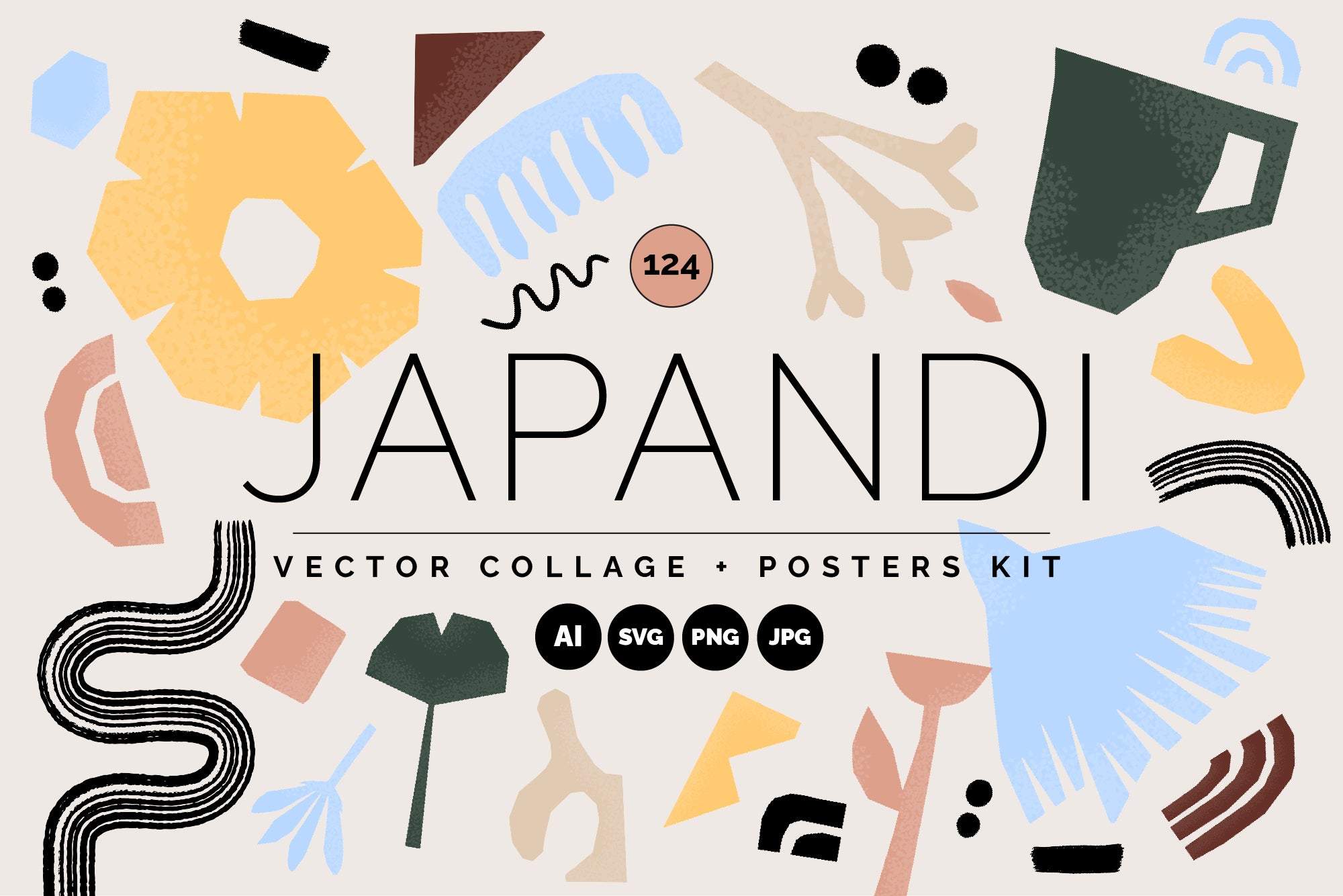
Shop: JAPANDI STUDIO Vector Kit →
What Light Pairs With (and Where It Gets Complicated)
Airy brand aesthetic pairs most naturally and most reliably with Soft, Romantic, Fresh and Organic. These combinations are coherent because they share the same fundamental emotional register: openness, gentleness, a certain unhurried quality that signals care rather than urgency.
Light and Romantic together produce something that is close to the most commercially effective combination in lifestyle and wedding-adjacent design: think hand-gathered florals, linen textures, the specific quality of light through a voile curtain. Light and Romantic together produce something that is close to the most commercially effective combination in lifestyle and wedding-adjacent design: a quality that carries sentiment without tipping into saccharine. Soft, airy gradients and gently diffused colour transitions do this work naturally; they suggest light passing through rather than landing on, which is a subtler and more affecting thing.
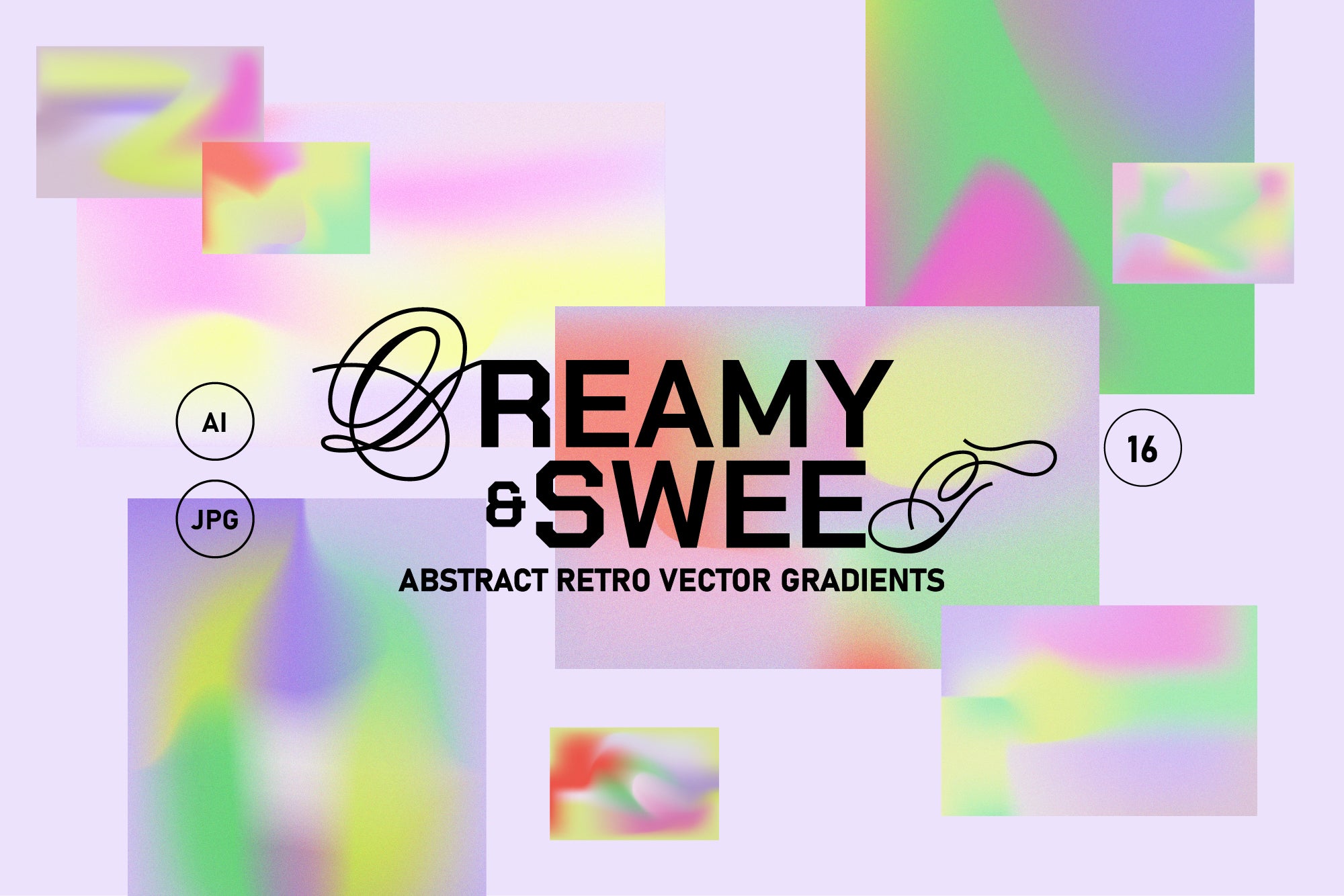
Shop: Escapism Vector Grainy Gradient Set →
The pairing that requires the most skill is Light and Bold: when a light-filled visual identity introduces a single saturated accent, it either sings or it shatters the mood entirely. The difference is proportion. A single deep element against a luminous ground reads as a focal point; more than one and you're competing with your own atmosphere.
Light and Dark require particular handling. They can coexist in a single system if they occupy different zones with clear purpose: a dark header with a light body, for instance, or dark type on a light ground (the most legible combination in existence, as it turns out). What doesn't work is treating them as equivalent options that sit at the same level; one always dominates and when you fight that reality, the composition loses its footing.
Where the Light Design Aesthetic Actually Lives
The contexts where light-filled visual identity does its best work are, perhaps unsurprisingly, the ones where the emotional stakes are high and the decision needs to feel easy. Wellness and health brands, independent skincare, bridal and occasion design, baby products, fine stationery, spring and summer editorial: these categories use light constantly because the emotional job they're hired to do is reassurance. Light says: this is safe, this is good, this will not overwhelm you.
But I'd push back gently on the idea that Light is only appropriate for soft, gentle, feminine-coded categories. Architecture and interiors use it with enormous sophistication: the specific quality of light in Scandinavian design, in Japanese wabi-sabi spaces, in high-end gallery environments. In these contexts, light is not about prettiness; it's about the relationship between space and perception, the way a pale ground makes you more aware of the objects within it.
Social content shot through with this luminous quality stops the scroll in a different register from Drama or Dark: it offers rest rather than provocation. In a feed that often reads as noisy and relentlessly intense, a genuinely airy composition is quietly arresting. The eye goes there because it wants relief; which is a kind of persuasion that tends to be underestimated and consistently underused.
Light pairs with: Soft, Romantic, Fresh, Organic, Delicate. Opposite trait: Dark. Explore more traits in the AIF Library.