
Dark As A Design Trait: Not Gloomy, Not Edgy, Just Right Enough
There is a moment within any well-designed interior, poster, or brand identity where darkness stops reading as absence and starts reading as intention. The dark design aesthetic is that moment, extended into a full visual language: one built on depth, shadow, weight and the particular emotional authority that only a genuinely low-key palette can generate. I'll make my position clear from the start: darkness, handled properly, is not a mood choice. It is a strategic one. And it is one of the most underused tools in the branding kit.
What Darkness Actually Signals
Strip away every gothic cliché, every energy-drink logo, every moody filter applied to a photo of a coffee cup on Instagram and the dark design aesthetic is, at its core, something much more interesting. It is about controlled contrast. It is about what you reveal and what you deliberately withhold.
Dark does not mean joyless. It means specific. A dark brand identity says, look: we know exactly what we want you to see and everything that isn't that is in the shadow on purpose.
The emotional register of darkness is wider than most people assume. It carries sophistication, certainly, but also intimacy: a candlelit room is dark and it is the furthest thing from forbidding. It carries weight, authority and the quiet assurance of something that does not need to shout to be heard. Shadow aesthetics, the specific craft of knowing how light falls and where it doesn't, create depth in a two-dimensional space that no amount of flat-colour cheerfulness can replicate. That depth reads subliminally as richness. As value. As an invitation to look closer.
The moods a genuinely dark visual language generates: calm authority, intrigue, luxury, sensuality and a very particular kind of seriousness that never tips into severity. The opposite of Dark is Light; and neither sits above the other in any hierarchy. Light is openness, clarity and the breezy legibility of a brand that wants to feel approachable. Dark is depth, weight and the slow-burning reward of a brand that asks you to lean in. Both are tools. Knowing which one your brand actually needs is the skill.
How the Dark Trait Shows Up
Dark colour palette branding lives or dies on the specific black you choose. There is no such thing as "just black." There is blue-black, which reads as precise and slightly cool: think luxury fashion, technology, architecture. There is brown-black, which is warmer and older: tobacco, aged leather, Victorian botanical illustration, heritage spirits. There is green-black, which carries the specific weight of old money and forest interiors. And then there are the near-blacks: deep aubergine, midnight navy, the colour of a very old library at 11pm.
The shadow aesthetics of a genuinely dark visual language do not flatten everything into uniform darkness. The craft is in the gradation: the way a background shifts from near-black to something fractionally lighter. The way a typeface in off-white against a deep slate reads not as mere contrast but as relief: like something emerging rather than sitting on top.
Typography in a dark palette wants weight and confidence. Heavy serifs with genuine mass; the kind of letterforms that feel as though they would make a sound if you dropped them. Or, conversely, extremely fine type in pale tones against dark: the contrast is its own drama. For texture, dark is where roughness earns its keep most honestly. A dark background with visible grain: paper texture, worn stone, the specific surface of very old painted wood: adds physical presence in a way that a smooth digital dark does not.
Heavy, deep, dimensional forms that carry genuine mass work with darkness the way architecture does: not as decoration but as structure. This is the visual logic that separates dark design with genuine authority from dark design that is simply dim.
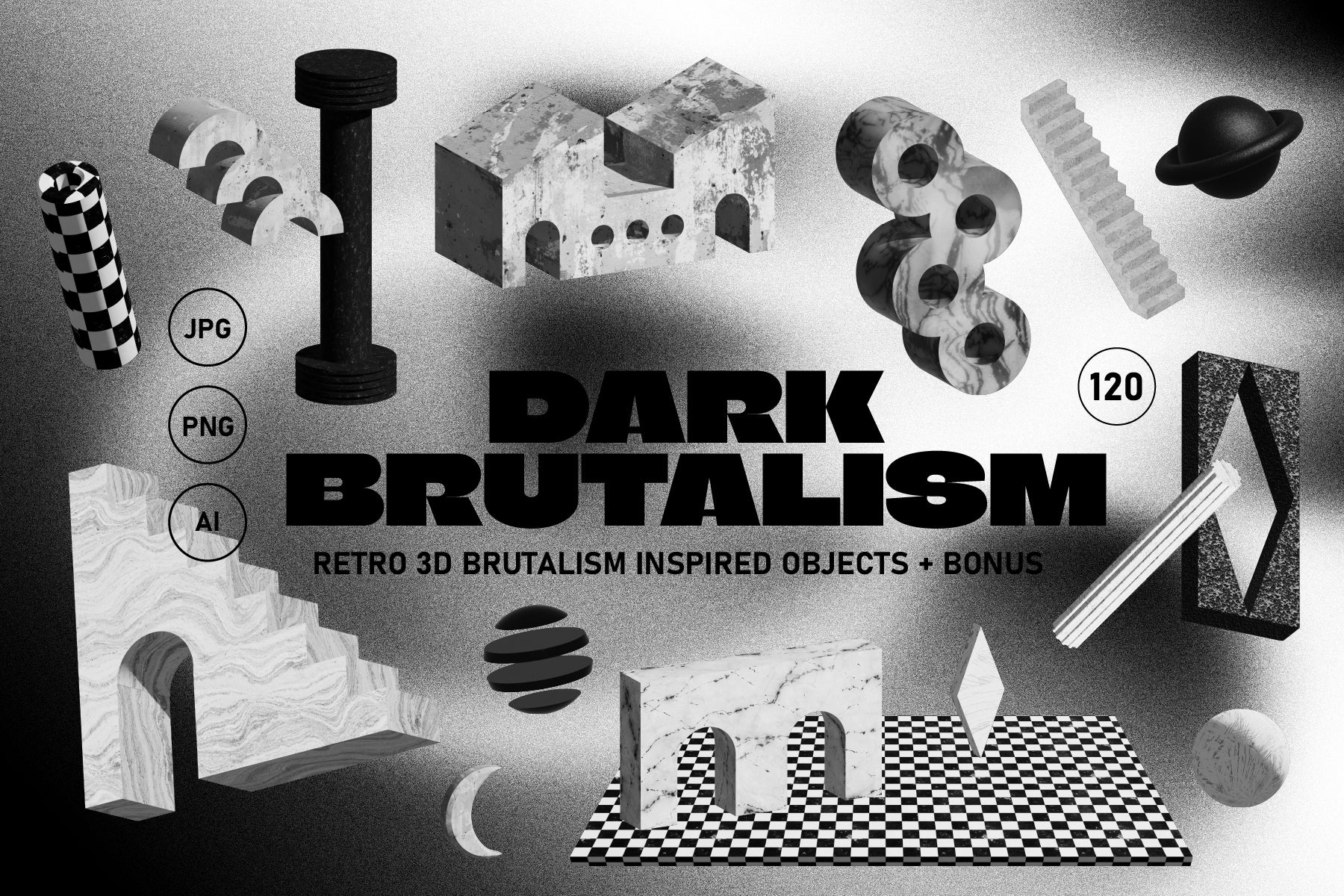
Shop: DARK BRUTALISM 3D Elements →
What Dark Pairs Well With
Dark is one of the most sophisticated traits to pair, because its wrong pairings are much less obvious than its right ones.
Heavy is the natural partner: darkness and visual weight together create the specific gravity of high-end manufacturing brands, premium spirits, serious architecture, anything that wants to communicate that it is built to last. This is the combination that luxury brands have understood for decades.
Organic with Dark produces something genuinely interesting: think dark botanical illustration, black-stained oak, the deep green-black of a very serious garden in the rain. There is a whole territory here where moody visual design meets organic form and the Victorian herbarium gets translated into contemporary brand language. The result is neither gothic nor nostalgic; it is something richer than either.
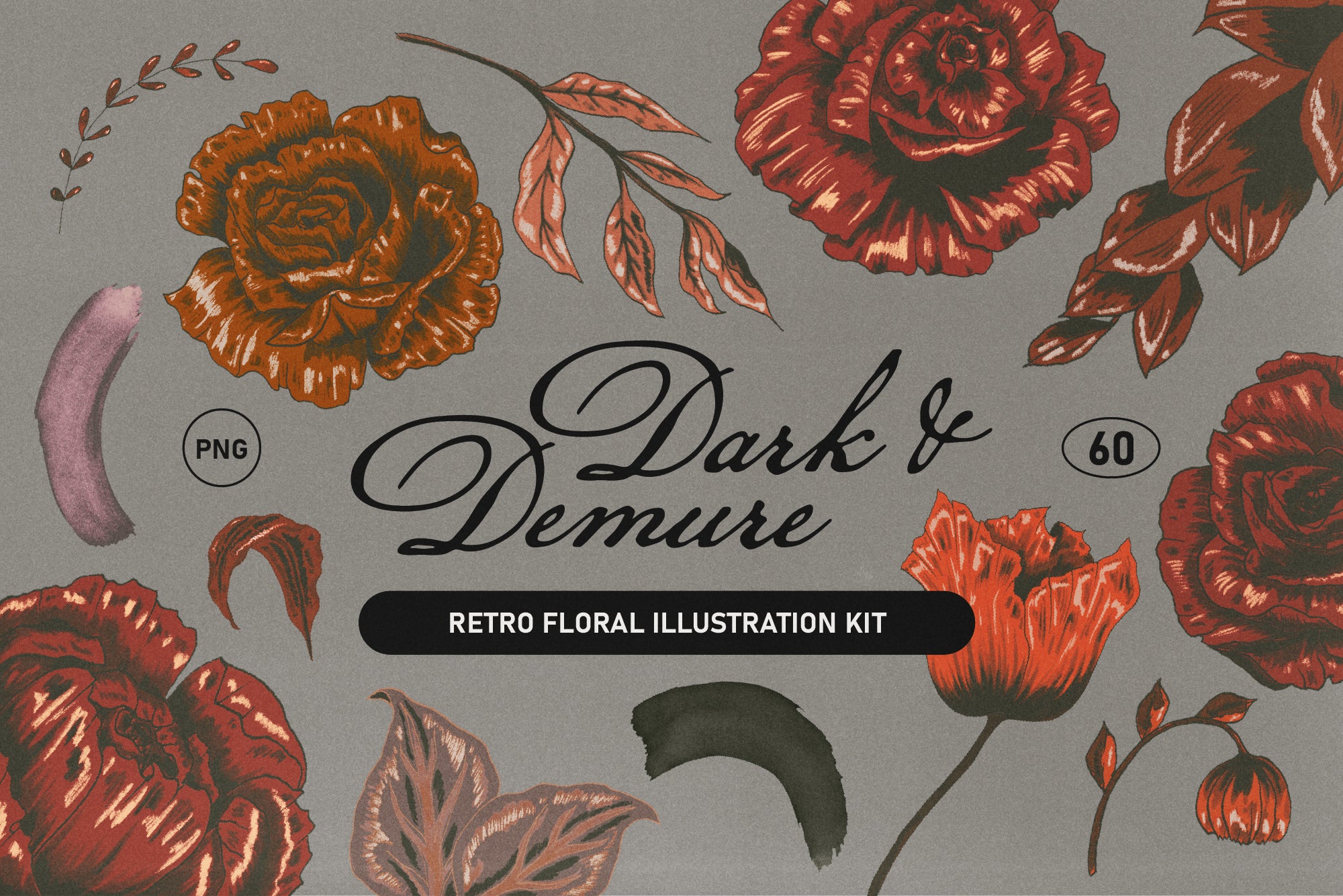
Shop: Dark Retro Floral Illustration Set →
Cold and Dark work together when precision is the point: tech brands, architectural firms, fashion with a structural sensibility. Cold-dark says: everything here was intentional, nothing was left to chance. Minimal and Dark is the combination I return to most often when advising brands that want to feel genuinely premium without the expected language of either maximalism or Scandinavian pastel-and-pine minimalism. Dark minimalism is its own register. It has a kind of monastic authority. It says: less, but the less is expensive.
Where Darkness Pays Off
Packaging is where dark colour palette branding pays off most immediately. A dark box with minimal typography and considered material weight communicates before it is opened. It says: what's inside was thought about. That is worth an extraordinary amount in a market where most packaging is trying to shout at you from the shelf.
In social media, shadow aesthetics do something specific to the feed. In a scroll full of bright flat product photography and AI-generated high-key imagery, a genuinely dark visual identity stops the thumb. Not because darkness is unfamiliar, but because committed darkness is. The half-hearted dark, the one that is really just a desaturated mid-tone, is everywhere. The one that knows exactly what it is doing is not.
Brand photography with a dark sensibility: low-key lighting, deliberate underexposure, subjects pulled from shadow rather than lit from everywhere at once: is one of the cheapest ways to differentiate in a market where every competitor is shooting on a white sweep. I'd argue it is also one of the most honest: it photographs products the way the best architecture photographs buildings, as objects in relation to light and space, not as items to be catalogued.
Dark, done with this level of commitment, is not an aesthetic choice. It is a claim about what kind of brand you are: one that believes depth is worth it, that your customer is worth the slow reveal and that shadows are not what you use when you run out of light. They are the design.
Explore the full AIF Library for more trait deep-dives, and see how Dark's luminous opposite, Light, operates when design leans into the power of brightness and the open page.