
Progressive As A Design Trait: Always One Step Ahead and Slightly Out of Breath
What does it mean to look like the future? The progressive design aesthetic is built around a specific proposition: that visual language can arrive before its time does; that a brand can use shape, colour, type, and texture to make the present feel already past. It is not futurism in the capital-F sense (please, no chrome rocket ships). It is something more precise and more interesting: design oriented permanently toward what comes next, carrying within it a restlessness the viewer can feel in their chest even when they cannot explain it.
What Progressive Actually Means as a Visual Signal
Let us be clear about what we are talking about, because "progressive" gets used loosely by brands that mostly mean "we updated our logo." The progressive design aesthetic is a structural orientation, not a stylistic garnish. It shows up in the decision to use forms that feel unfamiliar rather than familiar; to reach for the visual vocabulary that is arriving rather than the one that has already settled. The signals are specific: high contrast, geometric precision, asymmetric compositions that feel dynamically off-balance; colour palettes sitting just outside the comfortable range; typography that has somewhere to be. The mood this generates is urgency: the sensation that something is happening now and you had better keep up.
Innovation in visual identity is always, at its core, a bet. A brand that adopts a forward-thinking brand design posture wagers that its audience has the appetite to arrive somewhere new with it. The brands that get this right do not feel avant-garde for the sake of it; they feel inevitable. Like they already knew. The best progressive work does not read as radical; it reads as obvious in retrospect, which is perhaps the most sophisticated compliment you can pay a visual decision.
The opposite of Progressive is Heritage: and this contrast is one of the most instructive in the whole trait system. Heritage reaches backward for authority; Progressive reaches forward for it. Neither is better; they are different strategies for the same fundamental problem, which is convincing someone to trust you. Spend time with Heritage as its fascinating opposite: the comparison is more useful than almost any other tool for understanding what visual time-orientation actually does.
How the Future Aesthetic Shows Up in Practice
The visual language of this trait is holographic, iridescent, dimensional. Not because these things are inherently futuristic but because they carry a quality of light that the eye reads as ahead-of-its-moment. The most compelling work in this space operates at a level that feels less like graphic design and more like material science: surfaces doing something we do not quite have the language for yet. That sensation of slight conceptual inadequacy in the viewer is exactly what the Progressive trait produces at its best.
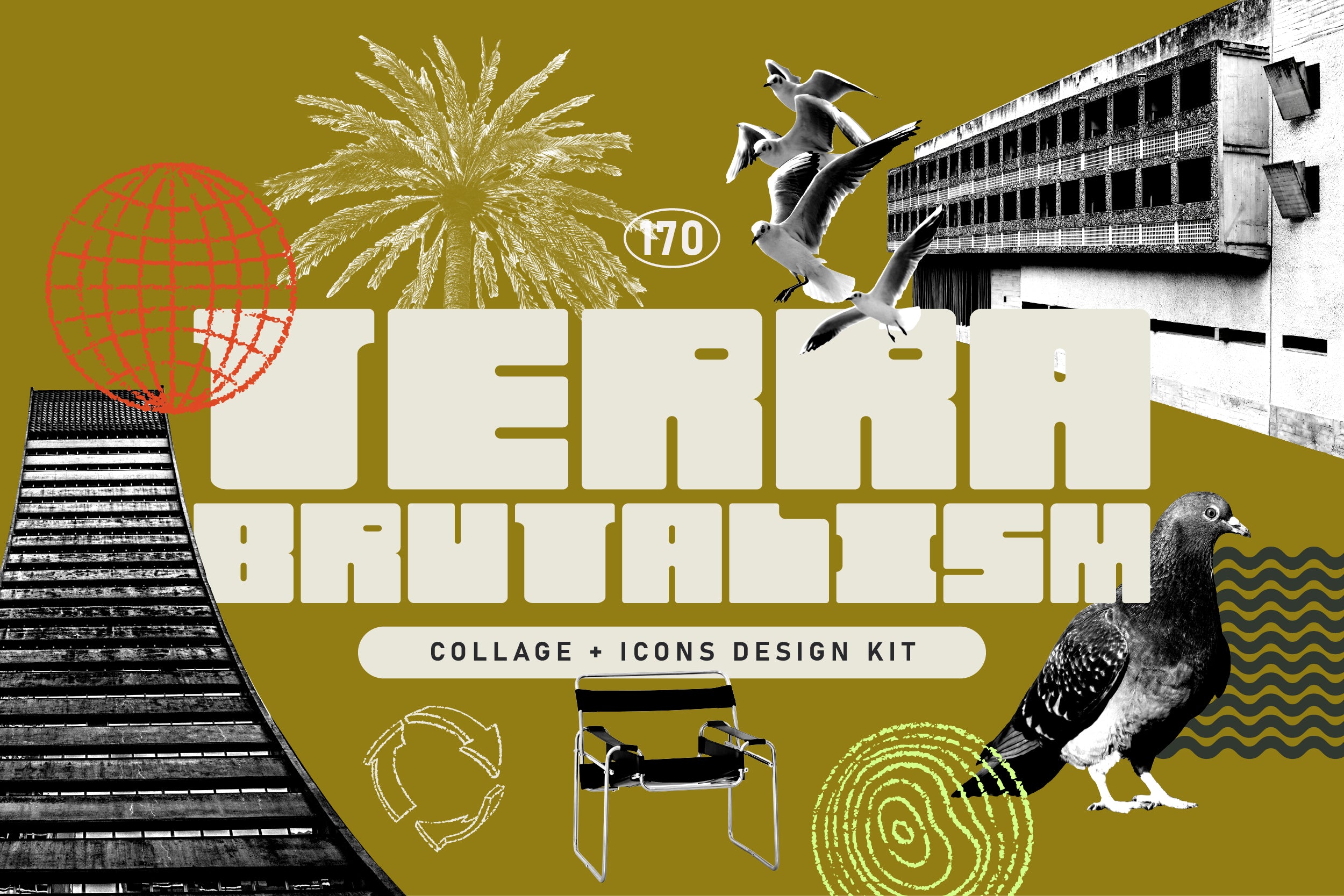
Shop: TERRA BRUTALISM Trend Design Kit →
In colour, progressive palettes tend toward the electric and the unexpected: acid greens, ultraviolet purples, the kind of orange that reads as a heat warning rather than an aesthetic choice. In typography, the trait loves the condensed and the extended: letters that take up more or less space than you expect them to; type set at a scale that forces you to rethink what reading is. Motion is central, too. Progressive design assumes the frame will not hold still.
The Brands That Actually Pull This Off
I want to name names here, because theory is only useful if you can see where it lands. Balenciaga under Demna has arguably been the most sustained practitioner of the progressive design aesthetic in fashion for the past decade: the decision to make ugly desirable, to push silhouette and proportion to the point of wrongness, is this trait at full throttle. Apple's visual language from 1997 to 2008 was progressive in the same way: not because it used futuristic graphics, but because it made every existing computer look immediately, irreversibly obsolete. That is what the best forward-thinking brand design does. It does not just look different. It reassigns your other references.
The avant-garde design tradition feeds directly into this: Constructivism's diagonal energy, Bauhaus's conviction that form should follow idea rather than tradition, the Swiss International Style's insistence on grid over ornament. What these movements shared was the belief that design could pull thinking forward rather than illustrate it after the fact. Long lineage. Serious one.
The most forward-looking work in this register is dimensional and sculptural: design that has processed its own history and come out the other side making something genuinely new. The postmodern reference is deliberate and the result is anything but nostalgic.
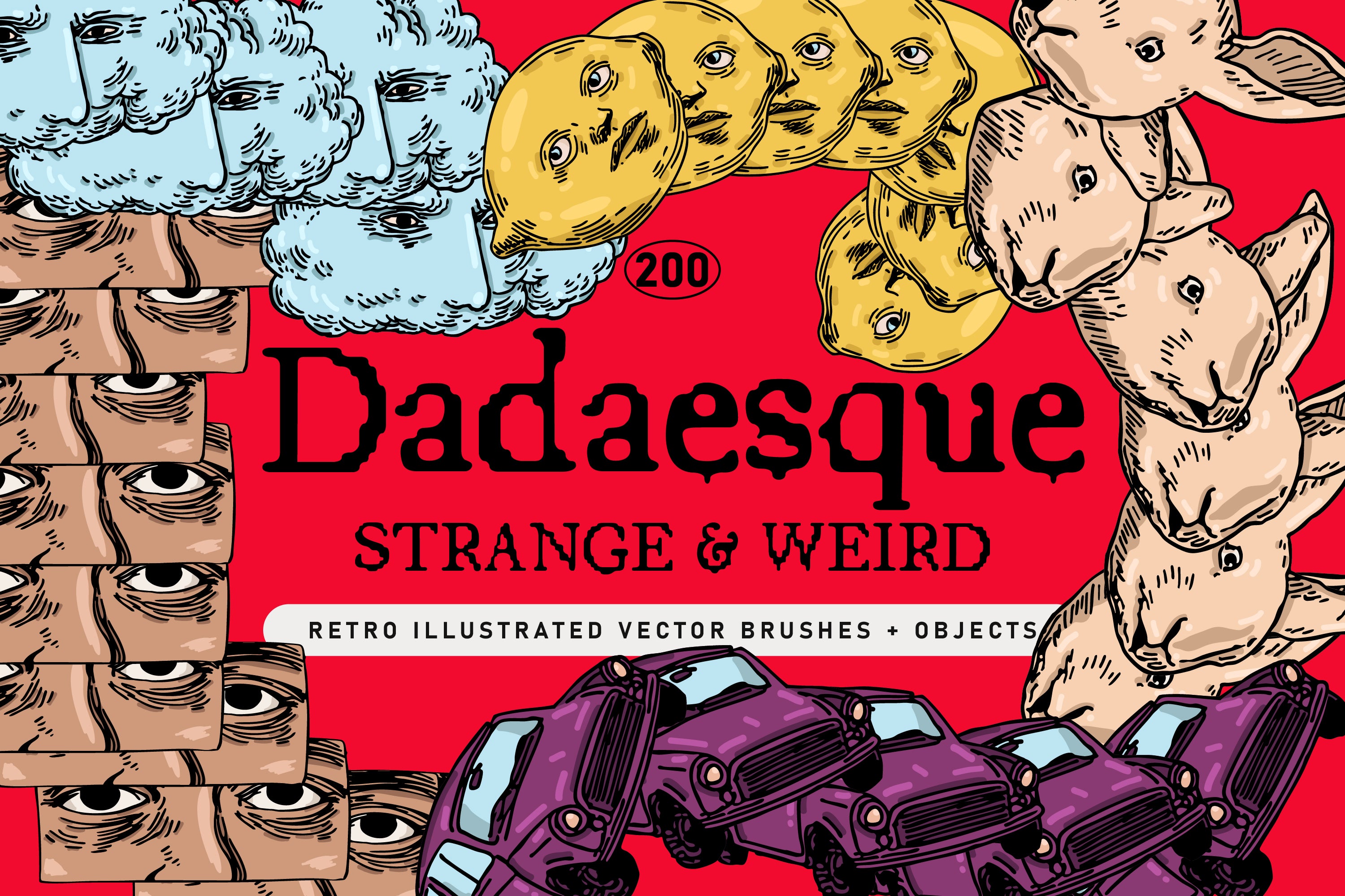
Shop: DADAESQUE Vector Icons + Brushes →
When to Use Progressive (and When It Will Work Against You)
Progressive works best when the brand's actual offer genuinely sits at the edge of something: technology, culture, conversation, category. It amplifies what is already there. It does not create credibility from nothing; if the product is middling and the design is radical, the gap between them becomes the loudest thing in the room. I say this not to discourage but because I think the Progressive trait is too often treated as a costume rather than a commitment.
Used with integrity, it pairs beautifully with Cold: precision and forward momentum reinforce each other. It also pairs well with Systemic, because structural logic can support the risk of a future aesthetic; the grid gives the viewer something to hold onto while the aesthetics push them somewhere new. The pairing to handle with care is Progressive and Warm: warmth suggests the known, the trusted, the human-scaled; progressiveness suggests none of those things. You can do it; some of the most interesting work right now does exactly that; but the tonal tension needs deliberate handling or it tips into confusion.
Browse the full system at the AIF Library: it maps every trait, every pairing, every contrast worth knowing.
What I believe about Progressive, stripped to its plainest form: it is not about aesthetics at all. It is about orientation. Where are you pointing? The visual language follows the intention; and when both are aligned, the result is the rarest thing in design: something that looks like it arrived from somewhere you have not been yet.