
Modern As A Design Trait: Always Moving the Goalposts and Refusing to Apologise
What does it mean to look modern? Not what it meant in 2018, not what it meant when Swiss grid typography was the answer to everything; what it means right now, today, in a visual landscape that has already moved on from what it considered current last season. The modern design aesthetic is the trickiest trait in the AIF Library because it carries no fixed address. It is a moving target that refuses to hold still long enough for you to pin it down. And I think that is exactly the point.
Why "Modern" Has a Birthdate: and Why That Matters
Before we talk about what modern looks like right now, it is worth acknowledging where the term actually came from. Modernism, with a capital M, was a specific and radical design movement that gathered momentum in the early twentieth century and produced some of the most consequential visual thinking in the history of the discipline. The Bauhaus, founded in Weimar in 1919, insisted on stripping ornament away and treating function as the primary driver of form. The Swiss International Typographic Style of the 1950s and 60s built on that foundation: the grid, the san-serif, the information hierarchy so rigorously organised that nothing was ever placed by intuition alone. De Stijl reduced everything to primary colours and right angles. These were not aesthetic trends. They were philosophical positions, argued through design.
Every time a designer reaches for clean spatial logic, a type system with mathematical clarity, a principled rejection of ornament: they are working within a lineage that Gropius, Müller-Brockmann and Mondrian laid down. The modern design aesthetic is not just a vibe. It has an intellectual inheritance and understanding that inheritance is what separates modern design that feels genuinely resolved from modern design that is just wearing the clothes.
That is why its opposite, Retro, is such a useful conversation partner: Retro reaches backward with both hands; Modern refuses to look behind it. They are not enemies so much as siblings who are not speaking.
Understanding modern brand design means accepting that you are working with a relational concept. The aesthetic that reads as progressive in one decade is nostalgia bait in the next. This is not a flaw in the concept; it is the concept. Modern means "in dialogue with right now" and right now is always changing.
So what are the visual markers of the contemporary visual identity we would call Modern today? Clean spatial logic. Type systems that earn their authority rather than borrow it from historical weight. A confident use of structure that does not need to shout. Colour that serves function first, then feeling. And an almost principled rejection of ornamentation that cannot justify its own existence.
None of those things are permanent. But for now, they are the grammar.
The Problem with Chasing "Current"
Here is the trap and I have watched hundreds of brands walk straight into it: they mistake novelty for modernity. They see a current design trend emerge: the bento grid, the liquid chrome blob, the hyper-tactile 3D surface; and they sprint toward it. Six months later the trend has peaked, their rebrand looks dated, and they are already planning the next sprint.
This is not a modern design aesthetic. This is reactive styling and it ages faster than anything else on the shelf.
True modernity, the kind that holds, is not about catching the wave. It is about understanding why the wave is moving. Why are designers reaching for structural clarity right now? Because visual noise has reached saturation and the eye is desperate for resolution. Why is three-dimensionality back with such force? Because flat digital surfaces have been everywhere for so long that texture now reads as relief.
When you understand the underlying pressure, you can respond to it intelligently rather than mimically. The most useful contemporary design resources sit at exactly that junction: forward-facing form language, yes, but rooted in a formal logic that does not collapse when the trend cycle moves on. That is the difference between modern and merely new.
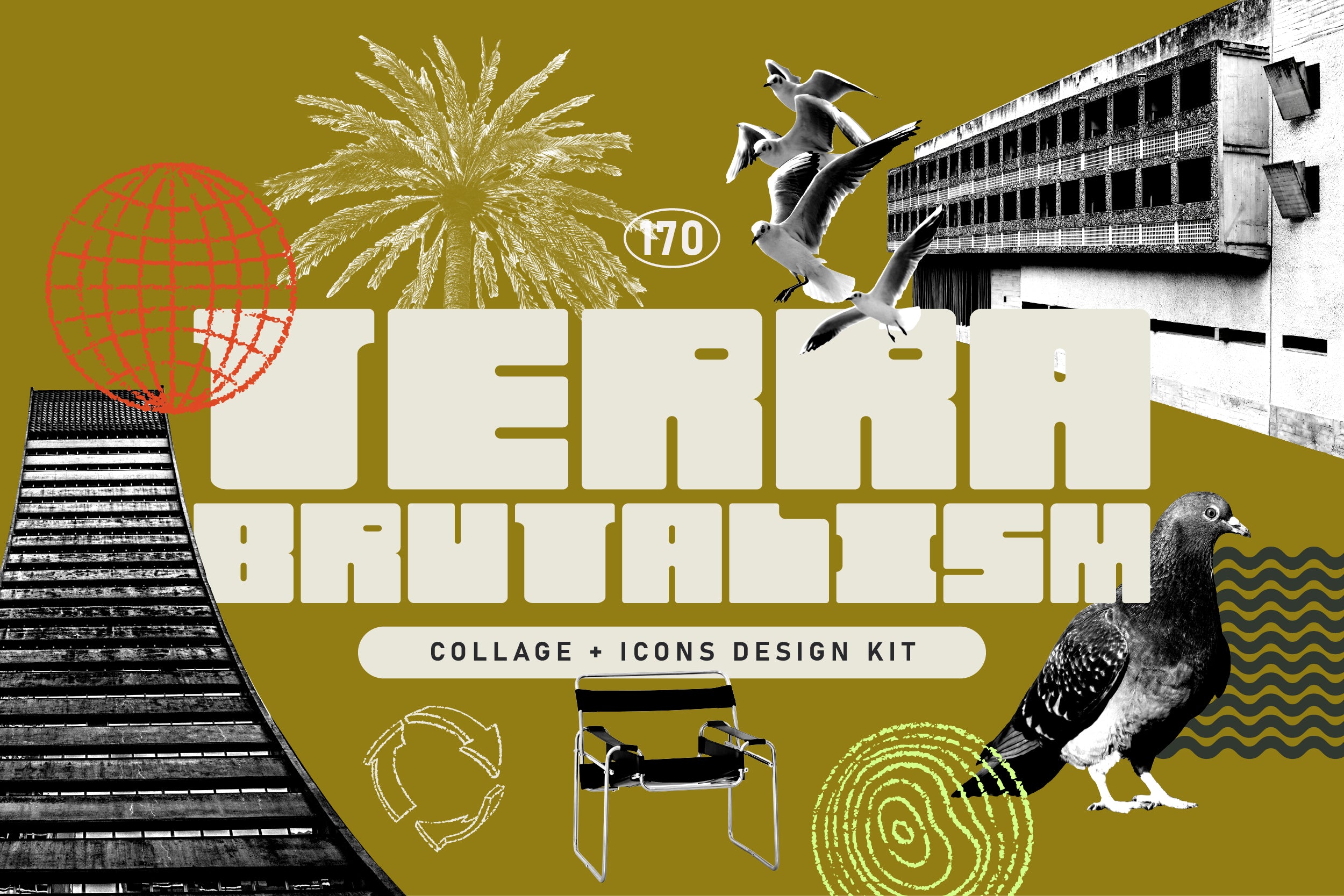
Shop: TERRA BRUTALISM Trend Design Kit →
What Modern Actually Asks of You
Let me be direct about something: modern is a discipline, not a mood board. It asks you to stay genuinely curious about why visual culture is moving in a particular direction, rather than simply registering that it has moved. That requires reading widely, looking at things outside design, and being willing to sit with uncertainty long enough to understand it rather than paper over it with a current design trend.
Modern design at its most resolved tends to share a few structural commitments. It trusts negative space as an active compositional element. It uses type with enough confidence to let it carry weight without relying on decorative support. It works with systems: grids, rhythms, repeating structural logic. And it applies colour with intention, usually restraint, occasionally boldness, but always with a reason.
The work that demonstrates this best is built around clean structural logic, progressive aesthetics that read as contemporary without being trend-reliant and a spatial clarity that would not look out of place in another two years' time. That is the test. Not "does this look like right now?" but "will this still read as considered when right now has already become then?"
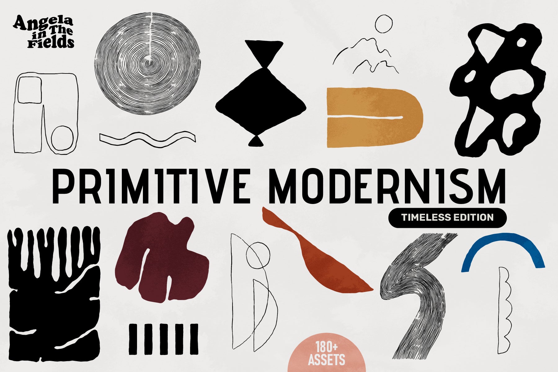
Shop: PRIMITIVE MODERNISM Vector Clipart →
Staying Relevant Without Losing Yourself
The most durable contemporary visual identity I have seen tends to share one quality: it knows who it is. It has a point of view stable enough to absorb external influences without being destabilised by them. This is not rigidity; it is groundedness. There is a difference between a brand that looks the same in 2019 and 2025 because it stopped paying attention and one that looks coherent across that span because it has been making deliberate choices the whole time.
Modern, properly understood, is less about the visual surface and more about the posture. It is the posture of a designer or brand that is paying attention without being anxious; engaged with the present without being enslaved to it. The modern design aesthetic, at its philosophical core, asks: what is actually true about visual communication right now and how do we speak that truth honestly?
That question never goes out of date. Which is perhaps the only thing about Modern that does not.