
Retro As A Design Trait: How to Borrow From the Past Without Looking Like You Got Stuck There
Everybody wants to look vintage until they look dated. The retro design aesthetic walks that line every single day: one side is warmth, wit, and the kind of immediate recognition that makes a stranger stop scrolling; the other side is a costume, a mood board cliché, a brand that smells like a cheap trick or prop. Knowing which side you're on requires something more than a good reference folder. It requires understanding why nostalgia works at all and what it's actually asking of you.
Why Nostalgia Is Always an Argument About Now
Here is what I believe: no one reaches for the past because they love the past. They reach for it because the present feels unresolved. Nostalgia in branding is not a history lesson; it is an emotional shortcut that says we understand what you miss. When a brand leans into a 70s design aesthetic, with its earthy ochres, rounded slab serifs and confident geometric pattern-making, it isn't selling 1974. It's selling warmth, craft, and a pace of life that feels less frantic than the algorithmic present.
This is why the retro design aesthetic keeps returning in cycles. Every decade or so, designers look back two or three decades, select the visual vocabulary that feels most emotionally charged relative to current anxieties and rebuild it with contemporary precision. The result is neither history nor pastiche: it is something that functions like memory, which is to say, it is selective, edited and flattering.
The best retro work borrows textures and tones but keeps its structure modern. Think of the way a well-designed vinyl record sleeve from the early 70s sits perfectly at home on an Instagram grid: the proportions still sing, the colour relationships still hold. Retro visual identity works when its underlying logic is timeless even if its surface is period-specific.
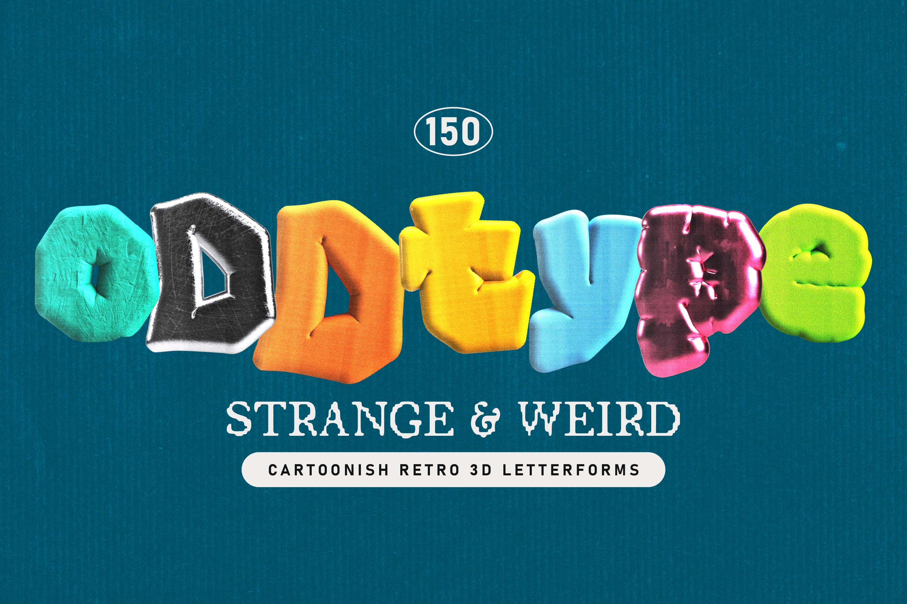
Shop: ODDTYPE Retro Letterforms →
The Vocabulary: What Retro Actually Looks Like
The retro design aesthetic is not a single visual language; it is a family of dialects. There is the warm, organic geometry of mid-century modernism: biomorphic shapes, muted palettes running from avocado to burnt sienna, hand-drawn imprecision treated as a feature. There is the 70s design aesthetic specifically: funky serifs with exaggerated stroke contrast, halftone textures, sun-bleached photography. Then comes the postmodern 80s maximalism: saturated neon, layered type, chrome gradients and deliberate visual excess. And the 90s, with its grunge photocopied rawness and distorted typography.
Each dialect carries its own emotional register. Mid-century reads as optimistic and craft-forward. The 70s feel communal and tactile. The 80s are futuristic in a way only the 80s can be, but also aspirational. The 90s are irreverent. Choosing your dialect is not an aesthetic decision; it is a brand strategy decision. What feeling are you invoking and does it match what your audience actually needs from you right now?
This is where vintage design trends trip most people up. They choose an era because it looks cool in isolation, then apply it to a brand that has nothing to do with that era's emotional promise. Retro without emotional coherence is just cosplay.
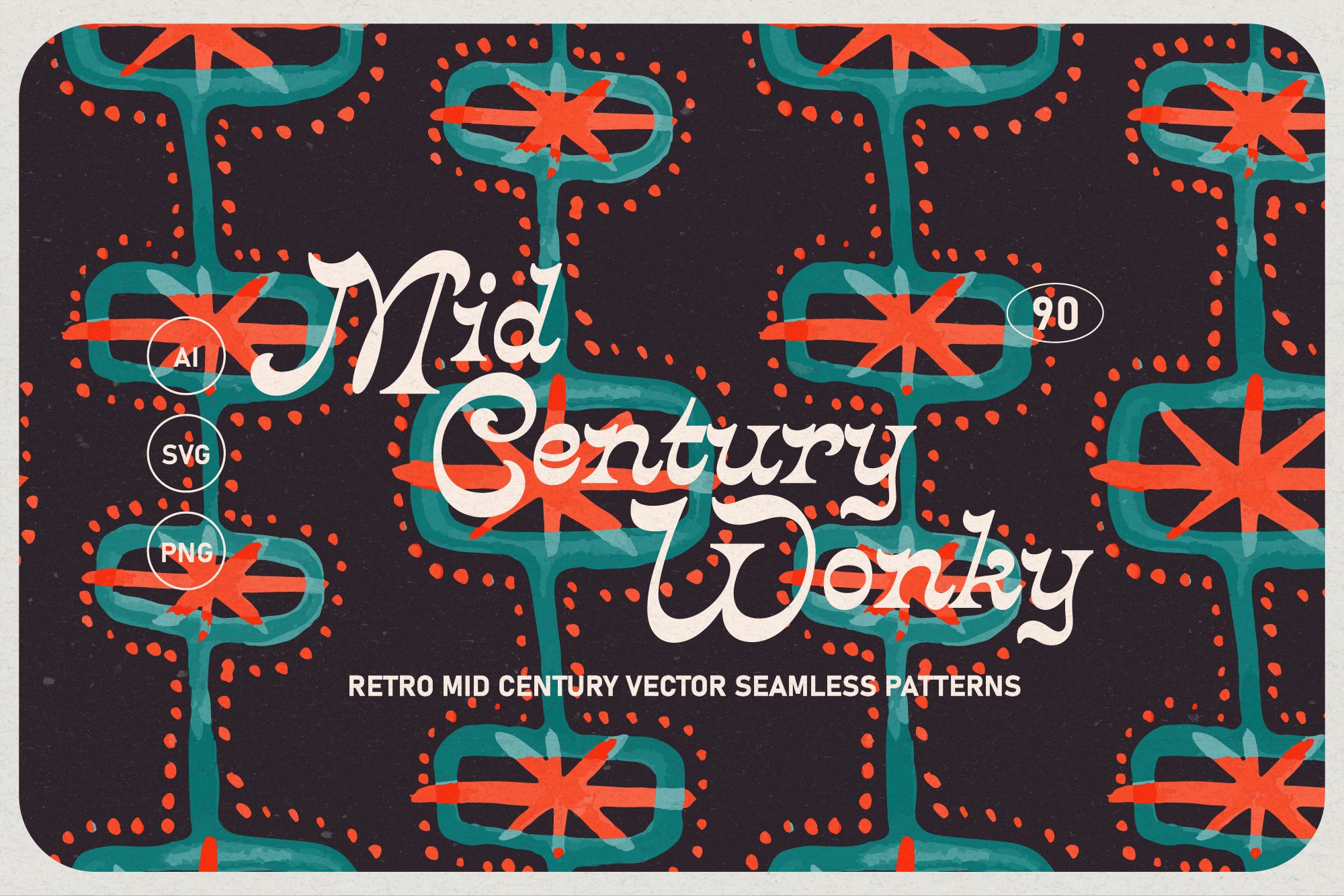
Shop: Mid Century Wonky Patterns →
How to Borrow Without Getting Stuck
The trick, and I say this as someone who has watched a lot of brands drown in their own reference folders, is restraint applied at the right moment. Not restraint in the sense of doing less, but restraint in the sense of knowing which elements carry the era's feeling and which are merely its furniture.
Take the 70s design aesthetic: the feeling lives in the colour temperature (warm, slightly dusty), the type personality (confident, slightly idiosyncratic), and the sense of hand-touch in the mark-making. The furniture is the macramé, the specific Herb Lubalin lettering, the Volkswagen camper van. Borrow the feeling; leave the furniture in the prop room.
You also need a modern foil. Every great retro visual identity has at least one element that is unmistakably now: clean digital whitespace, a sans-serif in the body text, a layout grid that reads as contemporary even if the illustration style does not. This contrast is what stops the work from looking archival. It signals intention. It tells the viewer: we know exactly what we're doing.
For deeper exploration of how heritage sensibility operates as a sustained brand language rather than a seasonal gesture, see the Heritage trait in the AIF Library. Heritage and Retro share source material but differ in temperament: Heritage builds continuity; Retro makes a point.
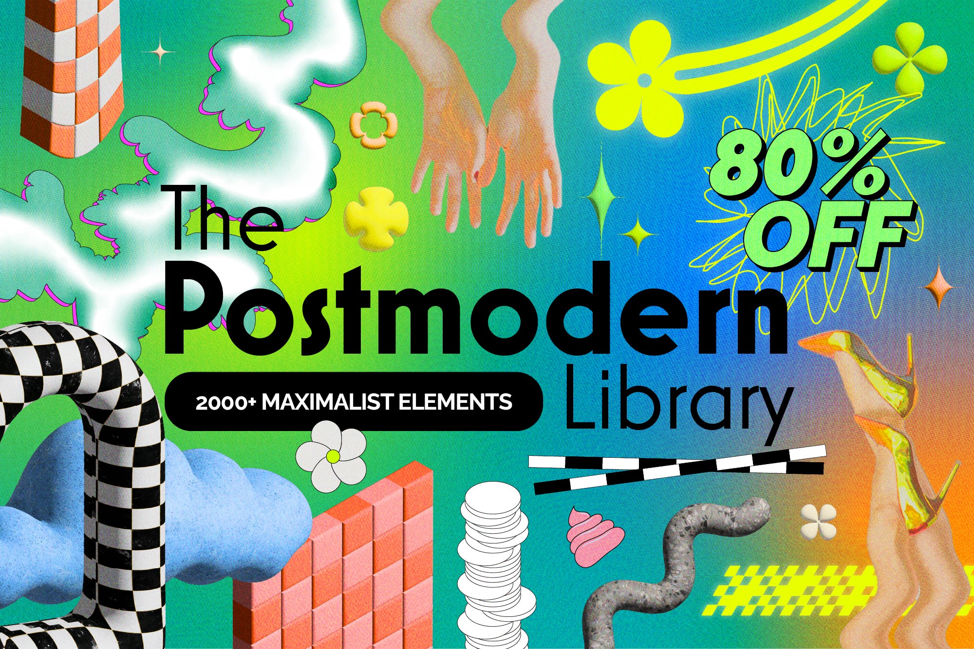
Shop: 80% OFF Retro Maximalism Library →
Nostalgia, My Friend, Is Always Future Tense
Here is the paradox at the heart of every great piece of retro design: it moves us because it reminds us of something we already know, but it works commercially because it makes that something feel relevant to something we don't have yet. The 70s warmth we reach for now isn't the 1970s. It's a projection of what we want the 2020s to feel like: slower, warmer, more deliberate, less optimised.
The retro design aesthetic, used with honesty and skill, is never about the past. It is about the desire for a different present. That is why it keeps working across every medium, every market, every brand category: because the desire for a different present is permanent. What changes is which version of the past most cleanly encodes that desire in any given moment.
So the question is not whether you should use the retro design aesthetic. The question is: which past is your audience quietly missing and what would it mean to give them a version of it that belongs entirely to now?
Explore the full AIF Library for more trait deep-dives and see how Retro's opposite, Modern, operates when design refuses to look back at all.