
Industrial As A Design Trait: A Love Affair With the Factory Floor
The industrial design aesthetic does not ask permission. It walks in, leaves grease on the doorframe and you love it for exactly that reason. Raw concrete, exposed pipe, steel that still looks like it remembers the foundry: this is a visual language built on honesty and honesty, it turns out, is wildly compelling. Designers have been falling for it since the lofts of SoHo in the 1970s and the affair shows no sign of cooling. If anything, in a moment saturated with smooth gradients and algorithmic perfection, the roughness has never looked more necessary.
Why Raw Material Keeps Winning
Here is something I genuinely believe: we crave texture because our digital lives have none. The industrial design aesthetic answers that craving directly. Unfinished concrete shows every pour. Welded steel keeps its seams. Reclaimed timber holds the grain of a century-old tree. These are not flaws; they are the entire point. Each material carries its own history visibly on its surface and that legibility is what makes raw material aesthetics so enduringly powerful in visual work.
The factory aesthetic branding movement understood this instinctively. Think of the design language of craft breweries, independent coffee roasters and small-batch distilleries: stamped type, kraft paper, honest materials, zero pretence. They borrowed the vocabulary of the factory floor because it signalled authenticity in a marketplace swimming in polish. The signal still works. Brands reaching for credibility still reach for exposed structure.
What is interesting, and this is where things get philosophically rich, is that industrial materials do not age badly. They age correctly. A steel surface develops a patina. A concrete wall takes on the light differently every decade. The raw material aesthetic is, paradoxically, one of the most sustainable visual investments a designer can make: it only gets better.
Building this raw, industrial tension into digital work means reaching for heavy geometry, brutalist surface logic and a tonal range that makes screens feel like they have weight rather than glowing from behind glass.
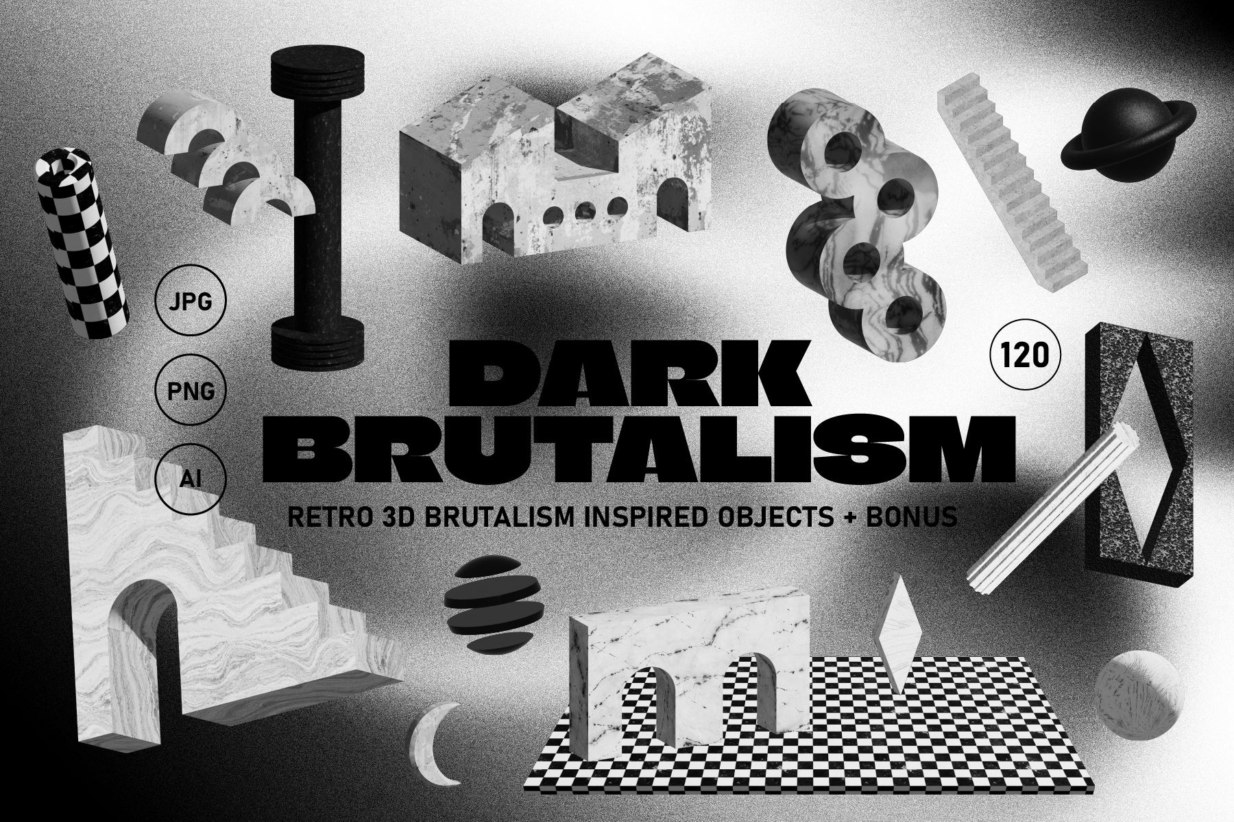
Shop: DARK BRUTALISM 3D Elements →
The Exposed Structure as Visual Argument
There is a reason exposed structure design is not just an industrial trend but a philosophical position. When you leave the ductwork visible, when you let the beam show, you are making a claim about what deserves to be seen. You are saying: the means of making this thing is not shameful. The structure is interesting. The mechanism matters.
This sits in direct opposition to the organic aesthetic, Industrial's opposite on the traits scale. Organic rounds things off, softens, hides the join. Industrial finds the join and lights it from below. Neither is wrong: they are different truthful positions about what beauty consists of. But I find myself consistently more moved by the industrial commitment to structural honesty. There is something almost moral about it.
Brutalist visual identity design operates from the same premise. Brutalism, in its original architectural sense, came from béton brut: raw concrete. The visual descendants of that movement in graphic design keep the same faith: show the grid, let the type land heavy, refuse ornamentation that does not earn its place. The result is work that feels like it has a spine.
Exposed structure design also has a democratic quality. When you can see how something is built, you can understand it. That transparency is, in a strange way, a form of respect for the viewer. They are not being handed a finished surface with nothing behind it; they are being shown the workings and trusted to find them beautiful.
Glitch, Rust and the Aesthetics of Use
One of the most interesting evolutions of the industrial design aesthetic is the incorporation of damage as design language. Not damage as accident; damage as archive. Rust records time. Glitch records process failure. Scanned surfaces show the physicality of the scanning act itself. These are traces of use and they give visual work a kind of experiential density that pristine production cannot replicate.
This is where the raw material aesthetic and the digital world have found their most productive meeting point. Designers are scanning industrial surfaces, photographing rust, sampling glitch and weaving these textures into work that needs to feel heavy, real and time-worn without being literally printed on corrugated iron (though honestly, respect to those who do).
Physically scanned surfaces pull directly from that territory: industrial grain and glitch noise give digital compositions a material presence that clean vector work cannot provide. The difference is perceptible immediately.
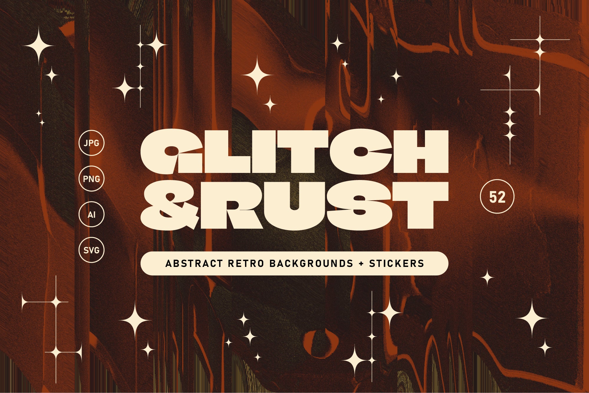
Shop: Scanned Glitch Textures + Bonus →
Heavy by Design: Industrial as a Living Trait
Traits in the AIF Library sit as sliding scales; they define where an aesthetic lives on a spectrum between two poles. Industrial lives at the structural, exposed, raw end of a scale that runs toward Organic at the other extreme. Understanding it as a trait rather than a fixed style is important: industrial energy can inflect a broadly minimal design, a maximalist composition, a digital interface or a printed poster. It is not a box but a dial.
The Systemic trait shares some of Industrial's love of visible logic: both value showing the mechanism rather than hiding it. But where Systemic tends toward order and repeatability, Industrial welcomes the irregularity that comes from physical making. The weld does not have to be perfect. The pour does not have to be smooth. That tolerance for the handmade mark is what gives the industrial design aesthetic its warmth, which surprises people who assume that steel and concrete must be cold.
They are not cold; rather leaning towards honest. And honesty, worn in over time like a good concrete floor, ends up being the warmest thing in the room.