
Heritage As A Design Trait: On the Fine Art of Making Old Things Feel Urgently, Devastatingly Relevant
Every designer alive has been briefed with the phrase "timeless but fresh." Most of them have stared at a blank artboard wondering what, precisely, that means. Here is what it means: it means heritage design aesthetic. It means reaching backward with enough intention and enough craft that the past stops being a relic and starts being a credential.
Heritage, as a trait, is not about old things; it is more about earned things. The visual codes that accumulate weight over decades: the engraved line, the worn gilt edge, the botanical plate reproduced in ink that looks almost too precise to be a reproduction. These are signals. And the audience reads them fluently, even when they cannot explain why.
The Authority You Cannot Buy at a Branding Agency
There is a reason every new luxury brand tries, desperately, to look like it has been operating since 1847. Heritage visual identity communicates something that a brief, a budget and a very expensive logo cannot manufacture: proof of survival. To survive, the logic goes, you had to be worth surviving. That is not nostalgia. That is evidence.
I think about this whenever I see a new skincare brand slap a serif font on amber glass and call it heritage. The font is doing work, yes. But heritage as a trait runs deeper than typography: it lives in the accumulated specificity of motif, in the repetition of pattern across decades, in the particular green of a garden-chair that appears on everything from the tissue paper to the seasonal catalogue. Legacy brand design is a system, not a gesture.
One collection in the library is a precise articulation of this idea. The motifs are rooted in the visual logic of early twentieth-century decorative arts: symmetrical, botanical, deeply geometric beneath their apparent elegance. They do not imitate heritage; they carry it, the same way a well-made document carries authority in its weight and its margins, before anyone reads a word.
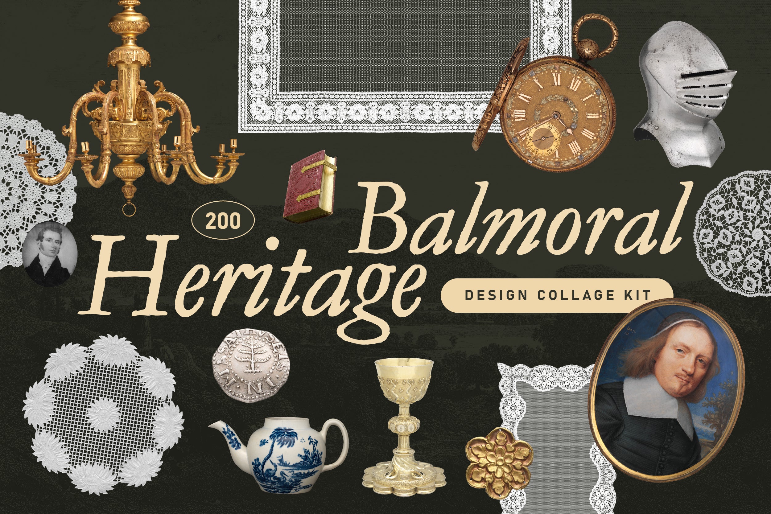
Shop: BALMORAL HERITAGE Trend Design Kit →
Why the Heritage Design Aesthetic Is Not Nostalgia (And the Distinction Matters)
Nostalgia is passive. It aches for a specific, personal past; it is sentimental and often a little blurry around the edges. Heritage design aesthetic is the opposite of blurry. It is incredibly precise. It selects, it edits, it knows exactly which elements of the past carry universal resonance versus which ones are merely old.
The difference is intention. A heritage visual identity does not reproduce the past wholesale: it extracts the structural logic of it. The proportions that predate trend cycles. The colour relationships that predate Pantone. The hand of the craftsperson legible in the line, even when that line has been digitised a dozen times. Traditional aesthetic, done with rigour, strips away the dated and keeps the durable.
Here is my honest view: most brands invoking heritage are doing nostalgia and calling it something grander. The tell is always specificity. True heritage has provenance you can trace: a particular print tradition, a named botanical illustrator, a documented craft process. It does not gesture at "the old days." It points to a specific room in a specific archive and says: this.
Craft as Argument: How Artisanal Branding Earns Its Weight
There is a material dimension to heritage that the digital age has made genuinely difficult to fake. Artisanal branding, at its most rigorous, is an argument made in texture, in visible process, in the evidence of a human hand somewhere in the chain of creation.
This is where the heritage design aesthetic becomes practically useful for the designer working right now. The illustration style should reference its forebears explicitly. The colour story should trace back to a natural world rather than a trend deck. The pattern grammar has internal rules you can feel even if you cannot articulate them.
Another collection in the library operates entirely in this register. The botanical language is classical and completely contemporary; the drawings carry the specificity of a naturalist's field notebook but render flawlessly across applications. This is the practical argument for legacy brand design: it travels. It does not expire at the end of a trend cycle. It compounds.
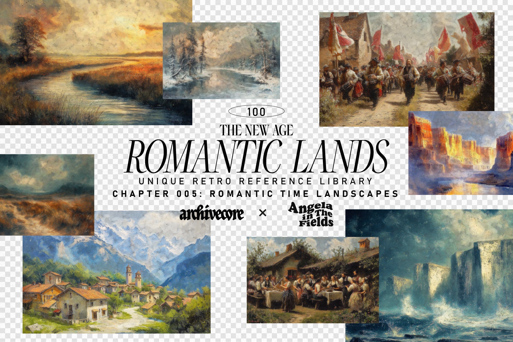
Shop: ROMANTIC LANDS Vintage Backgrounds →
On Living with the Weight of History (Without Being Crushed by It)
Heritage, as a design trait, sits in productive tension with its opposite: Progressive. One accumulates; the other disrupts. Neither is inherently correct. But there is something I believe with some degree of conviction: in an era of infinite scroll and two-second brand refresh cycles, the heritage design aesthetic has become genuinely radical. Choosing depth over novelty is a position. It is a refusal and refusals are always incredibly interesting.
The AIF Library explores this spectrum across traits, aesthetics and design decisions; the Retro trait sits nearby in the family tree but points in a slightly different direction: where Retro is self-aware and often affectionate toward a specific era, Heritage is structural and less interested in winking at the camera. Heritage trusts the material to carry the meaning without irony.
To use heritage well is to understand what the past actually built. Not a mood; a grammar. Not an aesthetic shorthand; a set of arguments about quality, continuity and the kind of trust that accrues only over time. You are not borrowing the patina. You are agreeing to earn it.
That is harder than it sounds. It is also, my friend, the whole point.