
Intuitive As A Design Trait: Makes the Best Design Invisible and the Best Brands Unforgettable
There is a particular kind of compliment that every designer secretly craves; almost no client knows how to give it: "I don't know why, but it just feels right." That is the intuitive design aesthetic at work; a quality so well-executed it erases all evidence of itself. You do not think your way into it. You do not analyse it. You simply arrive at a design and know, somewhere below the level of language, that you are exactly where you are supposed to be. This article is about that quality: what it is, how it gets built; why it is so much harder to land than it looks.
The Paradox at the Heart of Intuitive Design
The deepest irony of intuitive design is that it takes more rigorous thought to achieve than almost anything else in visual practice. You are designing for the absence of friction; which means you need to know, precisely and in advance, every possible point where friction might appear and then remove it before anyone notices it was there. You are, essentially, doing invisible work and then hoping no one sees it.
What Intuitive signals as a trait is this: the sense that the design is the only possible version of itself. Not that it is good (though it usually is); not that it is beautiful (though it often is); but that it could not logically have turned out any other way. Instinctive aesthetics work because they tap into visual and cognitive patterns that already live in the viewer; they are not asking you to learn anything new, they are confirming something you already half-knew. The keywords in this territory are effortless, frictionless, self-evident, natural, obvious; and those words are doing more work than they appear to be.
The opposite of Intuitive is Systemic: the design register where the structure is visible, where the grid announces itself, where order is the whole point. This is not a criticism. Systemic design is a genuine and powerful aesthetic mode; but it requires the viewer to do intellectual work, to read and decode the organisation. Intuitive design never makes that demand. The system is there, underneath everything, but it has been so thoroughly absorbed into the design that it simply cannot be seen.
The clearest illustration of intuitive quality in practice is design that feels as though it arrived fully formed rather than assembled. That is exactly the sensation intuitive brand work produces in a viewer. The logic is deep and deliberate; it just does not show its working.
How Intuitive Design Actually Gets Built
The mechanics of effortless brand design are, somewhat satisfyingly, entirely learnable. They are not mysterious; they are just rarely taught explicitly, because they involve designing in reverse: starting from the desired feeling and working backwards to the structure that produces it.
The first principle is visual hierarchy that never announces itself. In an intuitive design, the eye goes where it needs to go without being told. There is no bold arrow, no heavy-handed contrast meant to shout "look here"; there is just a slightly larger weight, a fractional shift in spacing, a relationship between elements that the brain reads as natural order. The viewer's attention moves through the design the way water moves downhill: without effort, following the logic of the landscape.
The second principle is restraint in decision-making. Every element in an intuitive design is there because it is necessary; not because it is nice, not because it fills the space, not because the brief called for it. I genuinely believe the hardest skill in design is not knowing what to add; it is knowing what to leave out. An intuitive layout breathes. It does not beg. It does not try.
Colour does specific, quiet work here too. Intuitive palettes tend toward the naturalistic; not necessarily muted, but tonal in a way that feels internally consistent. You are not noticing individual colours; you are receiving a mood, which is a different thing entirely. The palette has been chosen to disappear into the overall feeling.
Intuitive pattern and colour relationships feel effortlessly right, as though the season itself had been asked to design them. That quality is not accidental; it is the result of deeply considered decisions about what belongs together.
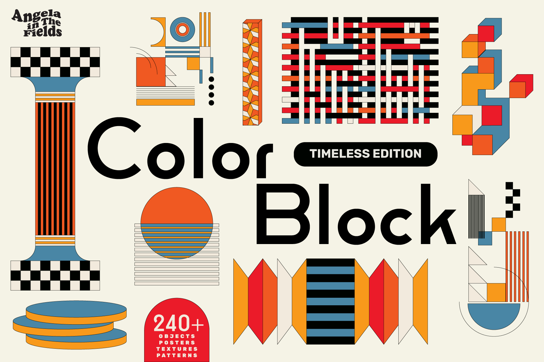
Shop: Retro Colour Block Vector Objects →
Where It Appears and Why It Matters
User-led visual identity is, at its core, an intuitive design project. You are building something that the person using it will navigate on instinct; not because they have been trained to, but because the design has been shaped around how they already think and move. The best brand systems are invisible design in exactly this sense: you never notice the wayfinding because you are never lost.
In packaging, intuitive design is the difference between a product you pick up without quite knowing why and one you pass over. There is a hierarchy at work in any retail or digital shelf context; but the hierarchy that wins most consistently is not the loudest or the most emphatic, it is the one that feels most inevitable. The most effortless brand design is always also the most confident: it makes no argument for itself because it does not need to.
In social media content, intuitive composition is what stops the scroll without trying. Something in the frame placement, the relationship between figure and ground, the colour temperature; something the viewer cannot name but immediately responds to. The AIF Library covers this quality across several related traits; Organic is a particularly close companion to Intuitive, sharing that quality of feeling-found-rather-than-constructed.
The Feeling-Obvious-Once-You-See-It Problem
The thing that makes intuitive design so rewarding when you land it; and so quietly crushing when you do not; is that it only reveals itself in retrospect. You cannot test for intuitiveness mid-process the way you can test for readability or colour contrast. You have to finish the work, step back, then either feel it or not. There is no rubric.
What I have come to think, after a long time working in this territory, is that the intuitive design aesthetic is ultimately a question of trust: trust in simplicity, trust in negative space, trust in the viewer's intelligence. The moment you start explaining yourself in the design, you have already lost the quality you were chasing. The very best design is the one that makes the viewer feel clever for understanding it, not the one that makes the designer look impressive for making it.
This is, if you think about it, a fairly radical act of generosity. You do all the hard work so that someone else can have the easy feeling. And you never get credit for it because, done right, no one even notices it was difficult. That is the whole point. That is the whole reward.