
Personal As A Design Trait: Why Sounding Human Is the Whole Strategy
Being seen is not the same as being known. That distinction is the entire argument for the personal brand design trait: the deliberate, craft-level choice to build visual and verbal identity around warmth rather than polish, proximity rather than authority, and the texture of a real human perspective rather than the frictionless surface of a corporate voice. Your audience can tell the difference. They always could.
What the Personal Brand Design Trait Actually Means
"Personal" is not a synonym for "amateur." I always advise clients to separate those two ideas early, because conflating them produces timid design decisions: a reluctance to use handmade illustration, a distrust of imperfect texture, a suspicion of anything that feels too warm. The personal brand design trait is about intentional humanity; it is about choosing proximity over distance as a strategic position.
Think about the brands that have stayed with you. The ones you return to not because they are the cheapest or even the best, but because they feel like they were made for you by someone who thought about you. That quality is never accidental. It comes from designers who treat warmth as a visual value, not a side effect.
In practice, the trait shows up in specific choices: hand-drawn or gouache-style illustration over flat vector precision; irregular, organic shapes over geometric grids; typography that breathes rather than commands; colour palettes that feel gathered from a mood rather than selected from a corporate standard. The effect of getting this right is immediate. The distance closes.
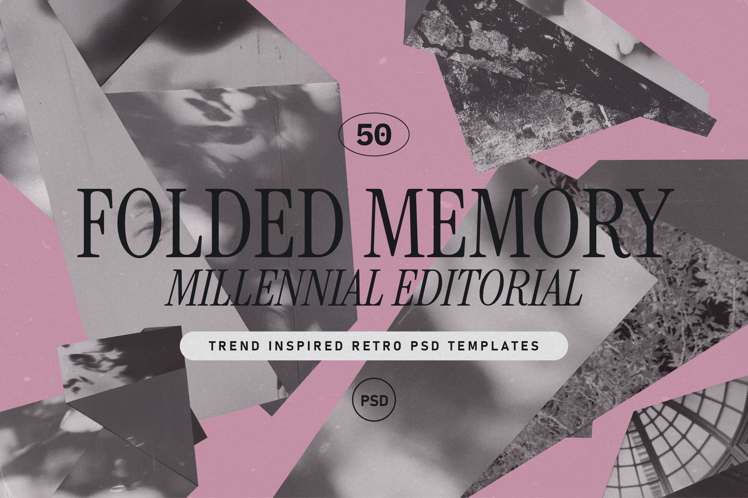
Shop: FOLDED MEMORY Retro PSD Kit →
Brand Personality as Visual Architecture
Here is the thing about brand personality: most designers treat it as a mood board category rather than a structural decision. They slap "warm" on a Pinterest board and call it done. The personal trait requires something harder; it requires that warmth be load-bearing.
What does that mean in practice? It means your illustration style has to carry the same message as your copy. Your spacing has to feel considered rather than defaulted. Your colour temperature has to align with the emotional register you are asking your audience to inhabit. Brand personality is not decoration layered over function; it is the function, expressed at every level of the system.
The opposite of Personal is Formal and Formal has its own considerable power (think luxury heritage brands, institutional authority, the deliberate ceremony of structured visual systems). Choosing Personal means consciously trading that kind of power for a different one: the power of feeling like a friend. That trade is worth examining carefully; it is not the right choice for every brand. But when it is right, it is extraordinarily right.
Authentic Design and the Problem With Looking "Crafted"
Authentic design is a phrase that has been through the brand-speak wringer so thoroughly it barely means anything anymore. So let me be more specific: what authentic means in the context of the Personal trait is that the visual choices reveal a point of view rather than conceal one.
The danger with "looking crafted" is that craft can become another kind of performance: perfectly imperfect, strategically approachable, warmth as an aesthetic posture rather than a genuine quality. Audiences are sophisticated. They read that gap. The brands that get the Personal trait right are the ones where the handmade quality is not just visual but systemic; it shows up in how they write, how they respond to customers, how they structure their offers.
My instinct here is always to start with the illustration and work outward. When you ground a brand in genuinely hand-drawn or organic visual elements, the rest of the system tends to follow. Hand-drawn line quality sets an expectation of care; it creates a visual promise that the rest of the brand has to keep. You cannot pair illustrations that feel personal with copy that sounds like a press release; the dissonance is immediate. The illustration forces honesty, which is exactly why I reach for it first.
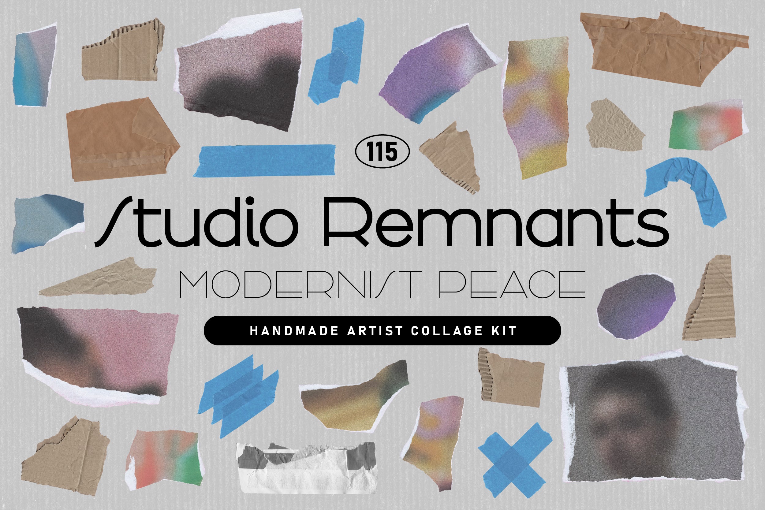
Shop: STUDIO REMNANTS Collage Kit →
If you want to explore more of these character-driven traits, the full AIF Library maps the entire trait spectrum, including the closely related Warm trait, which is a natural companion to Personal and worth reading alongside this one.
The Radical Act of Making Someone Feel Seen
Personal brand aesthetic, at its most essential, is an act of attention. You are telling your audience: I made this for you specifically. I considered your life, your context, your taste. I am not broadcasting at scale; I am talking to you.
That is not a soft position. It is, in fact, one of the most commercially durable positions a brand can occupy, because the relationship it creates is resistant to price competition in a way that purely transactional brands never are. You do not switch away from a brand that makes you feel known because something cheaper appeared. You stay.

Shop: 90s Collage Low Ink Kit →
The personal brand design trait is a philosophy that begins with a question: does this feel like it was made by a human, for a human? If the answer is yes and if that feeling is consistent across every touchpoint, you have done something genuinely rare. Not every brand should do it. But if your audience is the kind of person who notices the texture of things, who reads the copy, who chooses based on feel as much as function: make it Personal, my friend. Make it the whole strategy.