
Cold As A Design Trait: In Absolute Defence of Aloof, Austere and Slightly Intimidating Design
There is a particular kind of brand that makes you straighten your posture the moment you look at it. Nothing is excessive. Nothing is wasted. The silence in the composition feels deliberate, almost sculptural; the palette sits somewhere between glacier and gunmetal; with acidic accents. This is the cold design aesthetic at work: composed, exacting, and entirely unapologetic about the emotional distance it maintains. And I think we have been too quick to write it off.
Why Cold Is Not the Absence of Feeling
We tend to read warmth as emotional generosity and coldness as its refusal. This is a comfortable binary and it is almost entirely wrong.
Cold visual language has its own interior life. Think of the precision of early Braun industrial design, the unflinching restraint of Swiss International Typographic Style, the architectural gravity of Helmut Newton's fashion photography. None of these are empty. All of them ask something of the viewer: attention, patience, a willingness to step toward the work rather than have it rush to meet you. That request is itself a form of intimacy.
Austere branding operates on exactly the same logic. The absence of ornament is not indifference; it is a decision that the idea is enough. That the form will carry the weight. That you, the viewer, are capable of meeting it there.
Cold design is not the absence of feeling. It is feeling held at a precise and considered distance.
The Palette That Lowers the Temperature
Colour is the most immediate temperature dial in any composition. Warm design pulls reds, ambers and earthy tones into the foreground; cold design reaches instead for the upper register of the spectrum. Blues, blue-greens, silvers, the kind of white that has no yellow in it at all. Minimal cold palettes tend to restrict themselves almost violently: one icy accent, if any, against near-neutral grounds. The result is a visual atmosphere rather than a visual statement.
What makes this interesting is that restriction produces focus. When a brand removes warmth from its palette, it removes the easy emotional shorthand that colour usually does the heavy lifting for. The viewer cannot be seduced by a well-placed terracotta. They have to contend with the thing itself: the form, the type, the composition, the idea.
This is where a stark duotone texture collection becomes genuinely useful. Its two-tone colour language strips a composition down to its structural core; contrast becomes the only tool and contrast, handled well, is more than enough. The duotone format is inherently cool, inherently disciplined; it refuses to let complexity hide behind softness.
Cool Visual Identity and the Authority Problem
Here is the thing about cold brands: they are authoritative in a way that warm brands rarely manage. Not domineering, not aggressive; authoritative. There is a difference worth preserving.
A cool visual identity signals that the people behind it have nothing to prove. They are not trying to be liked. The confidence embedded in that restraint is, paradoxically, deeply compelling. We trust expertise that does not bend toward approval. We lean into the surgeon who is precise and calm over the one who is warm and slightly too eager to reassure us before the procedure.
Aloof brand design has always understood this. The luxury sector has built entire empires on it. So has a certain kind of architecture firm, a certain kind of engineering company, a certain kind of creative studio. The coldness is the message: we know what we are doing and we do not need to convince you of it with soft lighting and a friendly serif.
I hold a genuine opinion here: warmth, deployed as a default, has become one of the most overused levers in contemporary visual identity. When everything is approachable, nothing is. Cold is not a trend correction; it is a perennial option that has been crowded out by the algorithmic pressure to be immediately, frictionlessly likeable.
Where the Warmth Hides
None of this means cold design is without tenderness. This is the thing that surprises people and it is the angle I find most interesting to defend.
At the centre of the most austere, composed, unblinking visual work, there is often something quietly human. The impeccable type choice that took a hundred hours to decide. The single image in the layout that breaks the grid by half a millimetre, deliberately. The iridescence that catches the light and does something you did not expect.
A holographic texture set like this is a fine example of this interior warmth: cold, yes, iridescent and austere in its overall register, but with a luminosity that rewards anyone willing to stay with it. The surface repels at first glance; it offers at the second. That rhythm is entirely deliberate. It is, I would argue, more intimate than a design that opens itself immediately to everyone.
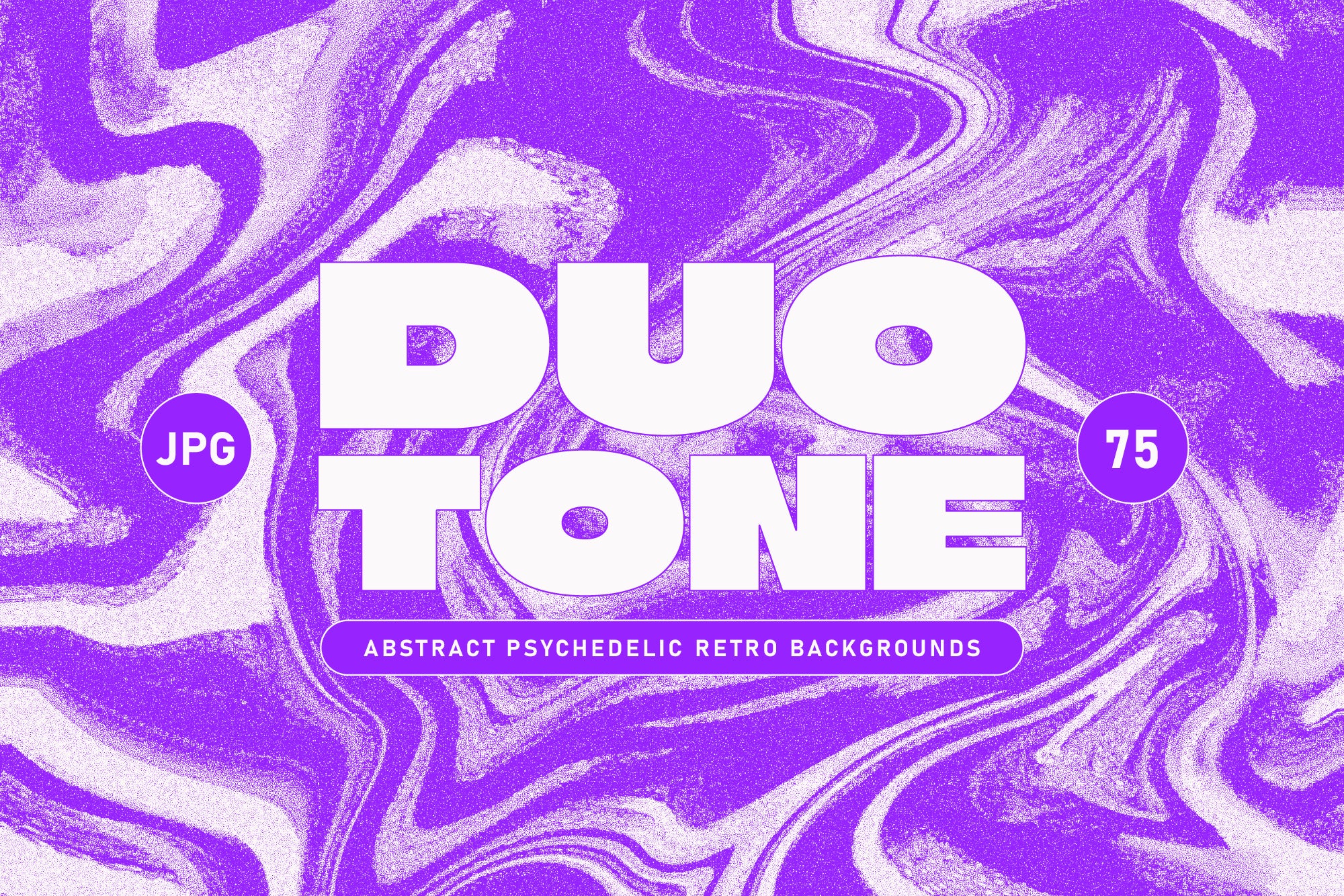
Shop: Duotone Psychedelic Textures →
This is not the only trait worth exploring in the AIF Library: Warm, its natural counterpart, operates from the opposite conviction, that openness is its own form of sophistication. Neither is more correct. They are different answers to the same question about what a brand is trying to ask of its audience.
A Temperature Is Not a Verdict
A brand that maintains emotional distance is not excluding you; it is shaping the kind of relationship it wants to have with you. Not transactional, not performatively intimate, but considered. Deliberate. Built on the assumption that you will bring something to the encounter rather than receive everything passively.
This is aloofness as a design philosophy: the belief that space, silence and restraint create room for genuine attention. And genuine attention is rarer and more valuable than any amount of manufactured warmth.
The cold aesthetic does not ask you to feel comfortable. It asks you to pay attention. And in a visual world that is increasingly designed to absorb your gaze without effort, that request is almost radical.