70s Revival Is Back In Full Swing
If you haven't banked in on the retro revival trend just yet, you're missing out big time.
The 2020s have become a smorgasbord of all things retro - anything from 20s to the noughties goes. But there is a special soft spot we hold for the 70s and their warm palettes. Slowly overtaking everything from product and packaging to interior, these nostalgic tones will dominate design for quite a while.
Below you'll find compiled some of the best retro 70s colour palettes as well as some design goodies that you can use to implement this style.

If you're interested in the 2024/25 trend that encompasses these lovely colour palettes as well, check out Newstalgia - my exhaustive trend report for designers, marketing experts, small business owners and more.
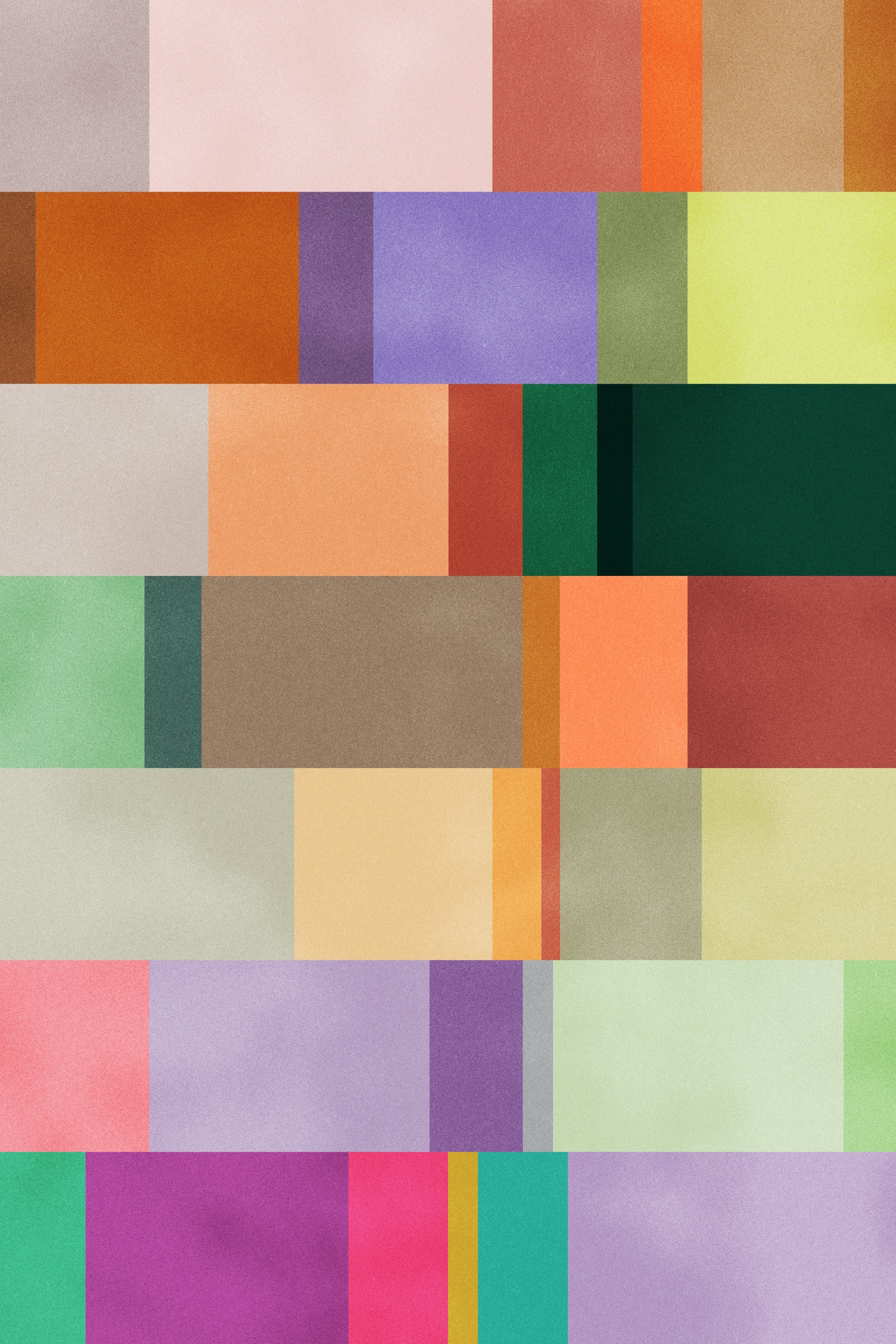
Here's a deep dive into the colour palette:
Chill Pill
Your typical retro colourway will include some oranges, off browns and a lilac. This is a quintessential colourway for all things late mid century, usually derived from furnishing and wallpaper colours from the late 60s. I like to dim them down just a little bit as you can see in the colourway, to give it a slight tinge of calm and chill. Use this for cool wrapping paper or late summer graphics!

Retro Kitchen
You know those cringe looking kitchens from the 60s and 70s that look like a doll house? Those, my friend, are the best reference for retro colour palettes. This one is from a picture I've since lost, but I've kept and used the colourway so many times. These would look great on velvet fabric or even some cool greeting cards.

Mod Con
The all time favourite for anyone who loves retro is 60s Mod. Usually a happy go lucky style, it consists of clean, minimal, but still bright colours. Perfect for stationery, wrapping paper and packaging prints.

English Cottage
This is definitely a result of two massive trends right now - that is any Academia trend (that has morphed from the beloved Cottagecore) as well as our love for period shows such as Bridgerton. A darker take than usual, this colourway is a more sophisticated take on old English estate inspiration. Think sophisticated florals on coloured cotton paper, a light ribbon and curly, prim fonts.

Sky High
One of my absolute favourites is this airy, chill, muddy pastel colourway. Inspired by 70s marble tiles, it is a welcome breath of fresh air in all the typical retro oranges and greens. If you design fabric, this is perfect for airy silks - or for packaging designers, think see through paper and milky plastic.

Bubblegum
You can't talk about retro without featuring some pink toned. This one is more reminiscent of the early 80s, what with its light hues and happy tones. Perfect if you want to try your hand at the famous Memphis style graphics.

Psychopop
And at the other end of the 70s revival is this punchy set - almost reaching the full potential of the 80s, it's much more saturated and reminiscent of the interiors transforming into hyper coloured spaces. Bright tones and shiny textures, this is the colourway of the dopamine.

INJECT SOME 70s IN YOUR DESIGN
If you're looking to get stuck in 70s revival, here's a list of design goods that will put you ahead of your competition:
Powered by Creative Market Powered by Creative Market Powered by Creative Market Powered by Creative Market Powered by Creative Market Powered by Creative Market